We’ve been a self-funded research lab since 1983.
We agree with Schumpeter, that entrepreneurs drive the economy in innovative directions large firms can’t. (Though we’ve brought many with us…)
Here are short descriptions of some of our most impactful projects.
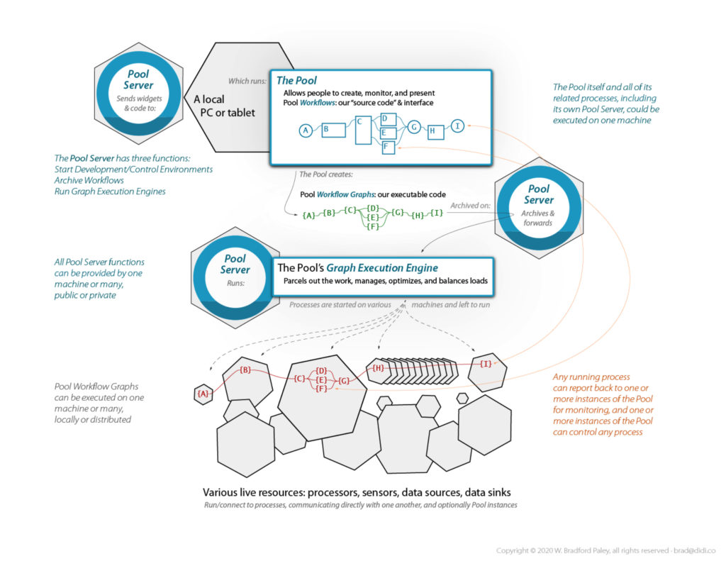
The Pool, current work:
An Environment for Integration + Analytics + Collaboration + Presentation + Testing/Deployment
The Pool is an active data sketchpad for all roles
• It optimizes human analytical thought
by rigorously applying Cognitive Engineering
• It doesn’t replace existing apps or roles,
it integrates them: pooling your resources and talent
• It makes data manipulation and analytical tasks
• easier to do
• with less risk,
• easier repeatability, and they’re
• profoundly easier to understand oneself
• (allowing more complexity)
• and communicate to others
• Contact brad@didi.co to participate
More about the Pool
How does one work in the Pool?
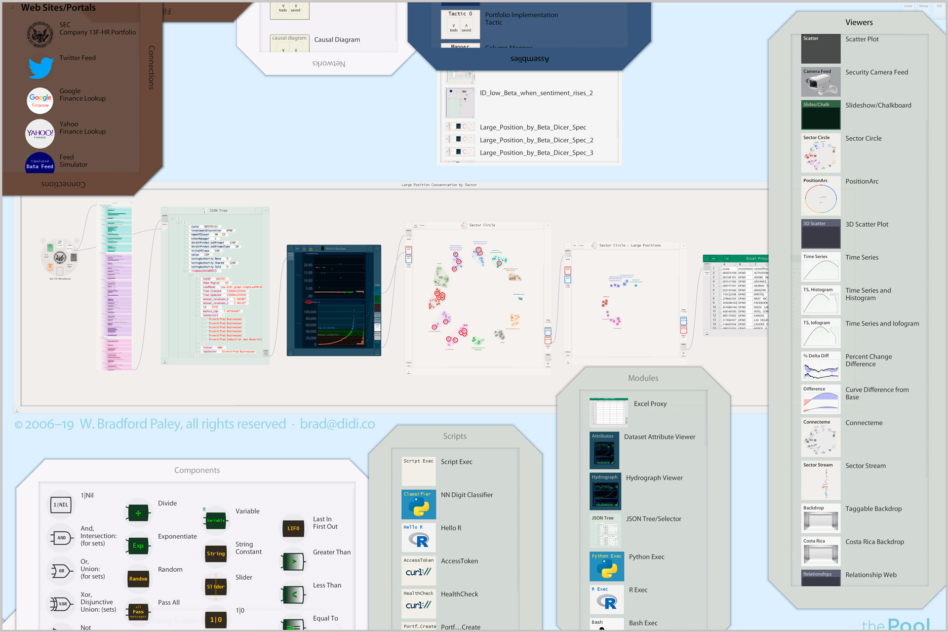
• Applications & data dropped into the Pool become Modules
• Sets of modules are saved as transparent, easily shared Workflows
• Workflows are parallelizable directedgraphs, communicating directly
• An Execution Engine manages Workflows on one computer—or thousands of processors in the cloud
What are some unique modes of operation?
• A modified GOFAI Blackboard System data space (flow+store, not just an API) lets this generation’s NLP/LLM AIs evolve a semantic layer—steered by humans: we create & assign meaning (a human thing, so far…); they search, pattern-match, catalog & generalize it
• A full history/audit-trail so you can look back at any past time while you’re working, even drag items—with state—to your current workspace to, e.g., start a new variation
• A catch-up mode when used as a shared whiteboard on, e.g., a video call: pause at any time—and when you unpause it can play faster than real-time until you’re back in sync with the others
Why did we build the Pool?
• Human insight is not yet obsolete
• Algos, strats, and learners beat humans on some tasks, but humans integrated with agents eclipse either
• People accomplish more when we communicate effectively
• Spatial understanding is the foundation of lateral thinking, innovation, and insight
• Good tools extend us: our capabilities and our minds
What’s the contribution?
• Cognitive Engineering optimizes:
• thought processes in individual human minds,
• collaboration between roles, and
• integration with machine learners and other computer systems
• It directly enhances cognitive processes
• It applies findings from many paradigms, with engineering rigor

The Pool is for Citizen Data Scientists
and everyone who needs access and clarity
watch how easy—even fun—it is to wrangle data in the Pool
Pool 2 Infrastructure, current work:
The Power of Assembly and the GPU, right in the Browser
Technological Contribution: A more stable development environment is beginning to evolve within browsers: Web Assembly. It lets us deploy less fragile, standards-chasing code within Web browsers. It also gives us access to the GPU supercomputer that’s inside almost every computer deployed in the last decade—including mobile phones!
Key advantage: This is not JavaScript: it is C++ code executing in your browser, driving the GPU directly by using WebGL. These are not static images: this test Web page renders hundreds of thousands of graphics primitives in real time.
Development Strength: We are building the Pool infrastructure with this technology, and our development pipeline allows us to compile to WebAsm for Web deployment—or, for a smooth transistion to even more power and access flexibility, compile the same source code for native deployment on various platforms. [Note: we have switched to Rust, still compiling both native and WASM, but far more secure; contact us if you’re interested.]
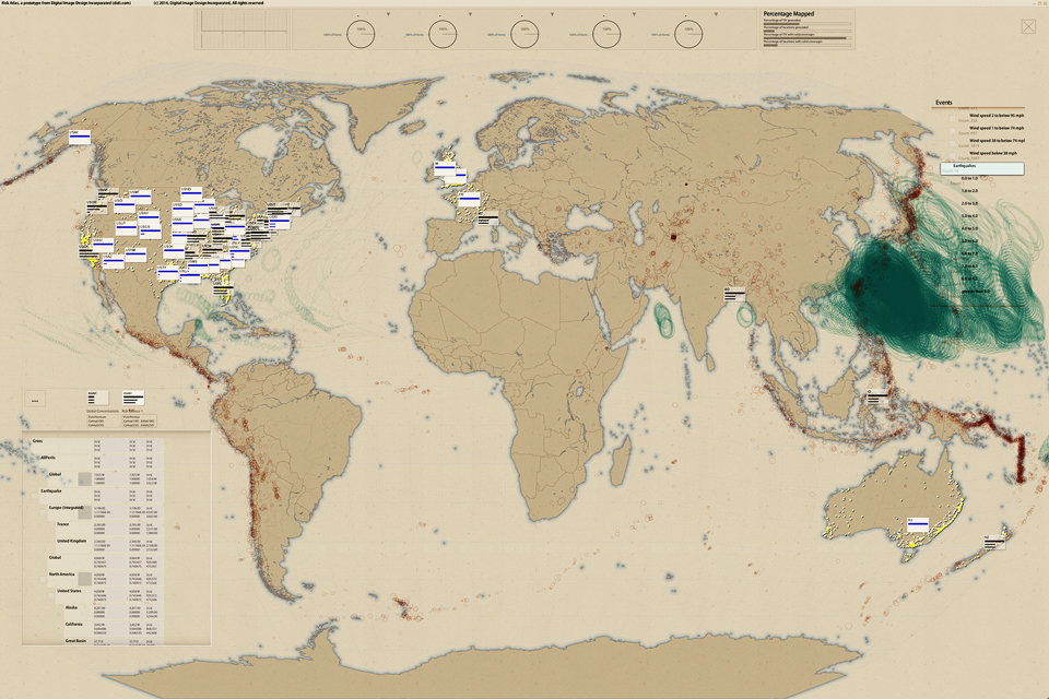
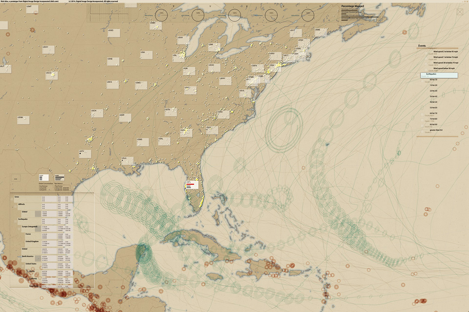
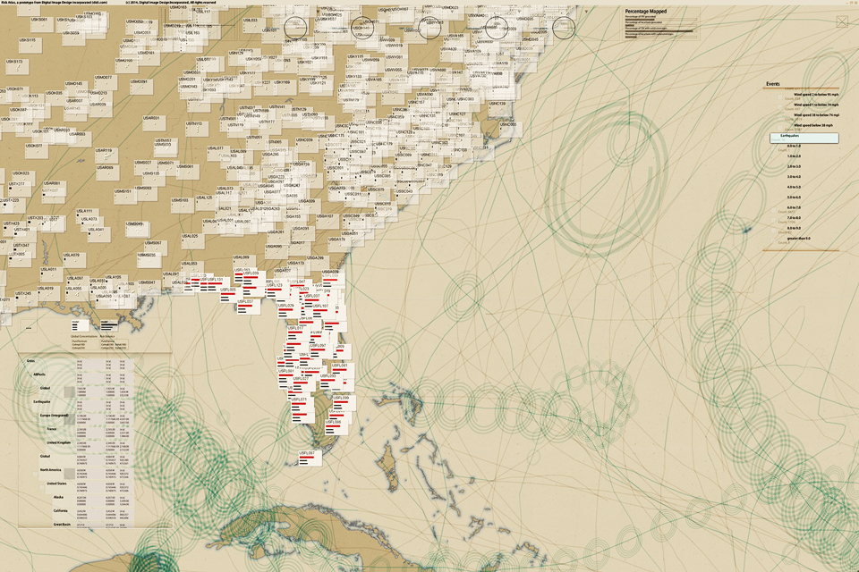
Risk Atlas, 2014:
Re/Insurance C-Suite Risk Analytics/Overview
Support for an Overlooked Audience: Allows C-Suite insurance executives to browse portfolios on a 4k Ultra-High-Definition touch screen, diced by geography, business division, or any other relevant data-cube dimension. Executives can simultaneously see up to a thousand half-inch glyphs that graphically illustrate strategic business issues, e.g., risk concentration/balance, or premium vs. expenses vs. expected loss.
Key advantage: It has never before been possible to break a portfolio into so many cells while retaining a global overview that allows finding trends and outliers—and the console for each cell can tell a complete business story: different consoles for different stories.
Key Innovation: Supports the hand-off of executive or board-level questions to direct reports, facilitating faster and more exact communications between colleagues—and people in different roles, because all are looking at exactly the same page.
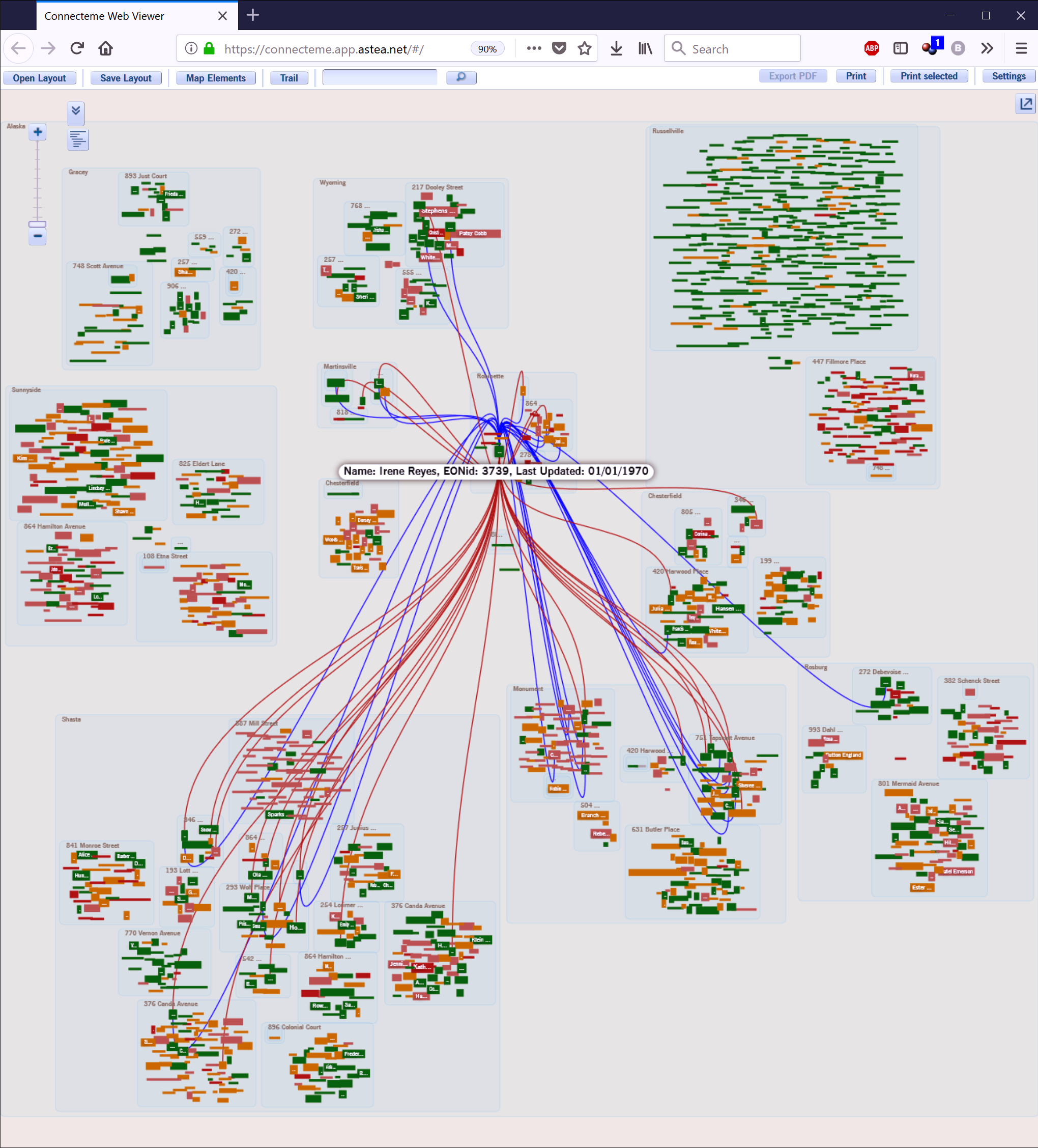
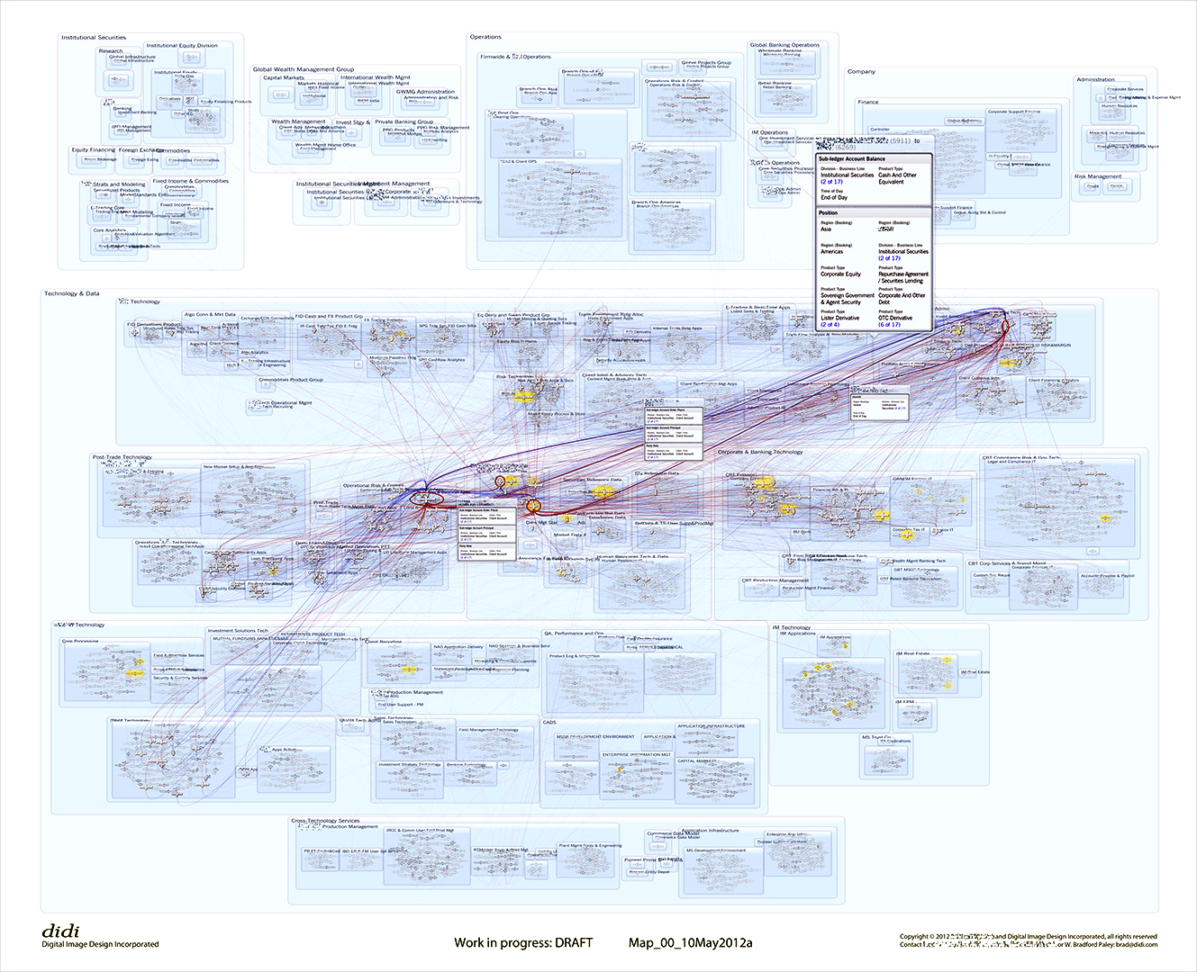
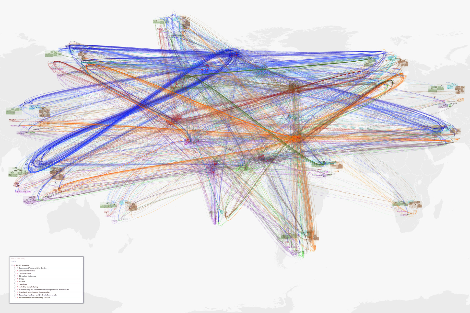
NetMap (was Connecteme), 2011:
Large-Scale Digraph Analytics/Overview
NetMap shows directed links between nodes, helping people understand network behavior through overall and detailed structure, just as the brain’s connectome is neural links between synapses.
The top two images show an early application to data flows between people and between systems, organized into a corporate hierarchy.
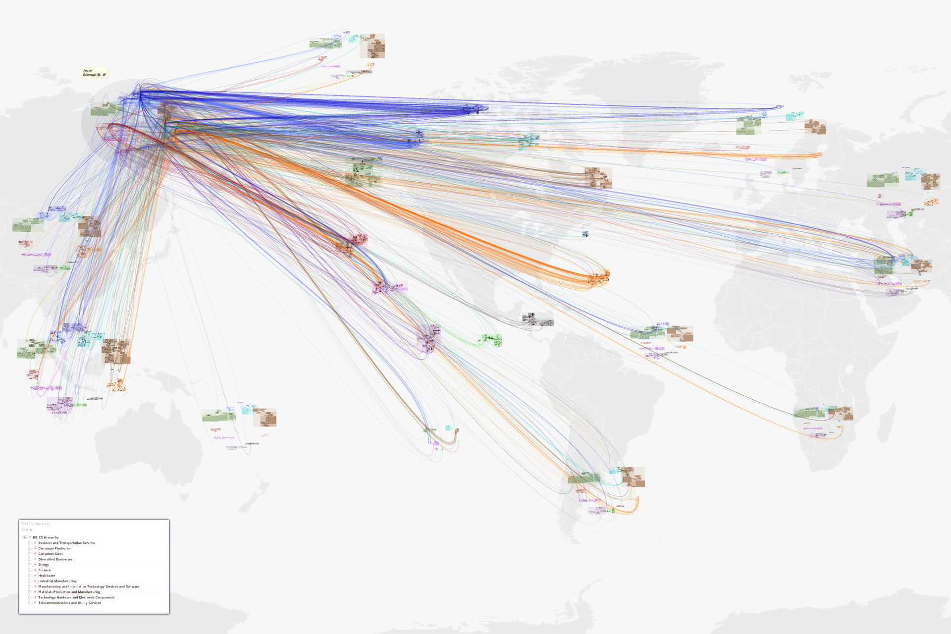
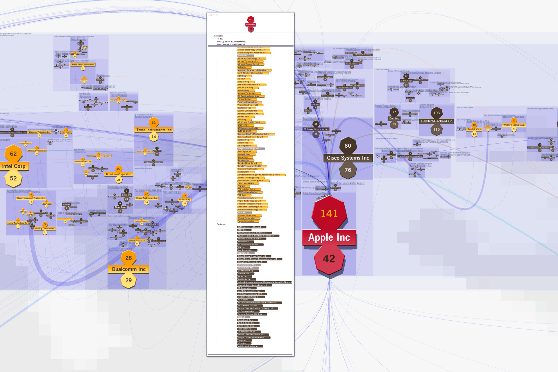
The rest show companies and their supply chain relationships, as organized into a sector hierarchy. Using a world map underlay as a recognizable “label” for sector hierarchies for different parts of the world, some 20,000 links among 6,000 nodes can be read to support insights and hypothesis generation.
One can click on a country to see all the links from and to that country (top: the US, next: Japan), do the same for any sector or subsector (not illustrated), and zoom in to see an individual company, its sector context and peers, and all of its suppliers and customers (bottom).
Key advantage: Often directed-graph networks become unreadable hairballs after a dozen nodes and a score of links are drawn. Here, thousands of relationships can be interpreted as a gestalt due to hierarchical, human-assisted (therefore meaningful) layout of nodes, and one can mentally filter down to make very specific insights about even individual nodes and links.
Key Innovation: Direction of links in this digraph can be determined at almost any scale due to the suppliers-in-the-top and customers-out-the-bottom visual encoding.
Key Innovation: Nodes are initially laid out with automatic rules, but humans can move individual nodes or groups for better recognition (e.g., putting sectors that mainly consume toward the bottom, or company divisions that run the organization at the top).
Follow this link for philosophy, details—and a case study analyzing fine-grained structure among global supply-chain relationships (bottom images here).
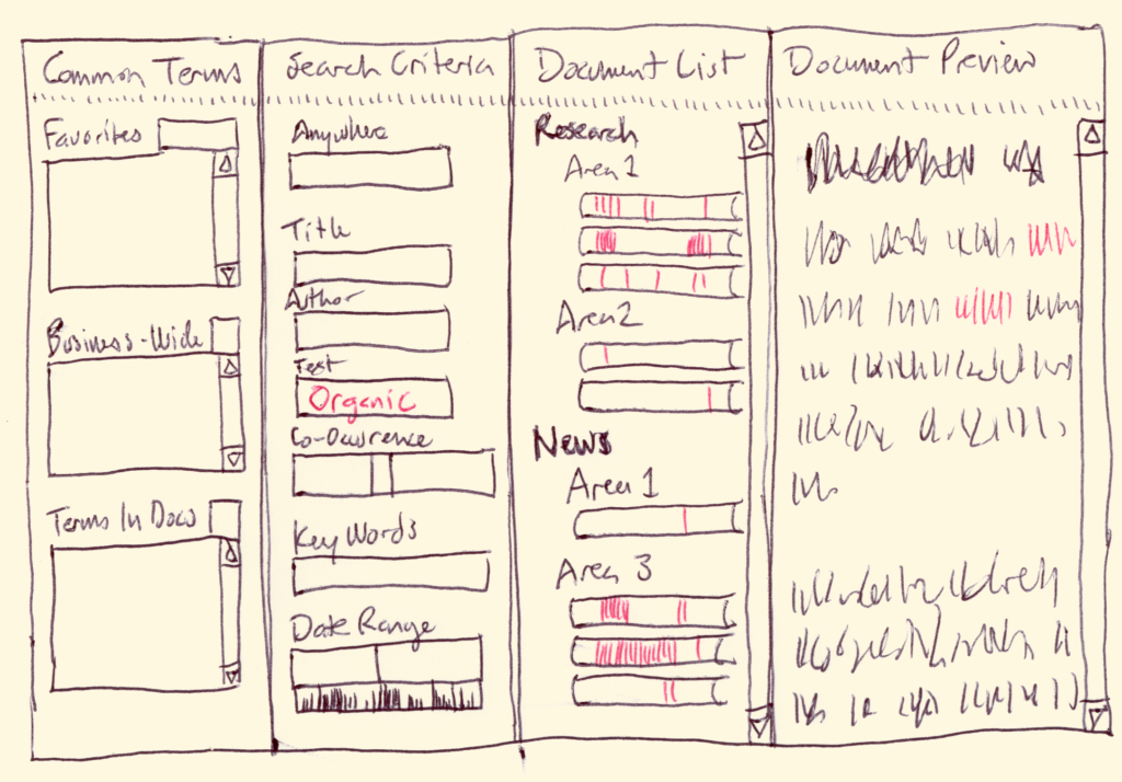
Content-Guided Search & Scan, c. 2003:
[Concept and conceptual architecture]
CoGSS is a search tool designed for medium-sized document libraries. It is tuned for library exploration and senior management use.
The layout is an easy-to-use left-to-right refinement search, with four panes:
• Common Terms: the search tool suggests what to look for
• Search Criteria: multiple ways to look for a document
• Document List: the list of documents that meet the criteria
• Document Preview: a curated excerpt of a document
More
Each pane has special features, we discuss them as the workflow will proceed: from left to right.
The Common Terms pane may have three lists in it, each one showing many possible search terms (e.g. Health, Atkins Diet, Organic, February 2003). The three lists are currently “Favorites” (a list that people can populate themselves), “Business-Wide Terms” (terms that commonly occur within the business), and “Terms in Selected Documents.”
This last list is rather special: it looks through all of the documents that are in the current “winnowed down” list of documents and shows the most commonly used terms—only in those documents. It can be a help for people to see what sorts of topics remain, and provide “proven” (known existing) terms to refine the search. It changes every time the Document List changes.
Contents of the lists may change depending on what search field is currently active, e.g. if the Author search field is active the Business-Wide Terms list may only contain valid author names. Lists may also be winnowed by typing characters into an empty “filtering” field at the top of each list—as each letter is typed the list is winnowed to contain only terms that contain the typed sequence of letters.
The Search Criteria pane has type-in fields for each criterion allowed in the searches, headed by one overall Google-like “search anywhere” field (which matches text in any of the other fields). Other common fields include Title, Author, Key Words, Text Body, Date Range, and Size Range. The last two range fields are assisted by active histograms, visible immediately under each field. By sweeping out a range on an active histogram, a range is automatically entered into the range fields—thus the histogram not only gives context, but provides an easy way to enter search limits.
A special “Co-occurrence” triple field allows people to enter two words separated by a distance (e.g. “Organic” 5 “Food”) allowing matches of any document that finds the first word within a specified number of words from the second.
All fields may be filled by typing into them; the Document List shrinks as each character is typed. Fields may also be filled by dragging search terms from any of the Common Terms lists. More search terms, specific to a given application (e.g. “Project”) may be added to this pane.
The Document List shows a constantly updated list of all documents that meet all of the search criteria. Each document is represented by a roughly rectangular object that has critical defining information about the document, for instance its title. These objects are listed in an outline-like indented hierarchy whose intermediate headings remain only so long as they have any selected documents underneath them.
The document objects are rich information displays in themselves: each one can be thought of as a miniature map of where the search terms occur in the document. Each search term has a characteristic color (e.g. “Organic” might be green, and “Food” might be brown), and vertical stripes are painted into the document object in a position proportional to where they occur in the document. This way, without even retrieving the document people can see how often a word occurs and its distribution within the document. E.g. if a word occurs 30 times in a chapter near the front of the document, there will be a concentration of lines of the right color near the left of the document object. Even more valuable: by sweeping out a range in the document object, the corresponding excerpt of the real document is downloaded and displayed in the last pane.
The Document Preview pane is filled with a whole document (if the document object is clicked) or an excerpt (if a range has been swept out). In a final implementation, this document or excerpt will have the same color coding as the search terms, allowing easy spotting of the concepts that people care about.
The information that is used in the text extract (and in all of the computational indexing and analysis) would come from text extracts that would be created to reside in the original database along side of the original formats. In this way, we could do full text searches in the full variety of formats people use to create documents (e.g. Excel, Word, PowerPoint, e-mail, Web pages). The document would be scanned in the raw text of the text extract, so that color-coding would stay consistent with the rest of the tool. But when the document was downloaded it would be received in the original format.
Bandwidth limitations may prevent the real-time display of some of the data (e.g. word co-occurrence filtering and word position stripes in the document objects). But that data could still be displayed by user request (e.g. a button click causing the information to be generated on the server, then sent to the interface).
TextArc, 2000:
A Tool for Structuralist Literary Analysis
Patented in 2003: US 20030235807
TextArc is a graphical index of a text that can be used with any text. It generalizes to show index, frequency of use, and distribution of any set of entities with respect to a linear ordering of another class of entities that contain them.
More
A TextArc draws the lines of an entire text in a tiny font, wrapped into a clock-like ellipse inscribed within the display bounds. This results in an unreadable mess; to make it useful, TextArc also:
• Draws each significant word at the centroid of its usages in the text; pulling it close to where it’s used most.
• Draws those words larger, brighter if they’re used more.
• Draws rays from those words (when hovered over in the interactive program) to where they’re used.
• Draws star-like “distribution glyphs” (in the print version) next to each word to show where it’s used
• Draws the word in a color related to position: saturation means a word is used mainly in one place, hue is determined by its position in the text; this allows words common to one area to be more easily seen when used elsewhere
• Background-color outlines around words separate them from words behind and make them more readable
TextArc has been exhibited in The Museum of Modern Art, a solo show at Arizona State University, the Chelsea Art Museum, Google’s New York headquarters, and it won Grand Prize [non-interactive] at the 2002 [6th] Japan Media Arts Festival, among many other appearances “in person,” on the Web, and in books.
Richer background and interactive, deeply-zoomable images of this and similar projects are at W. Bradford Paley’s “research-seen-as-art” site.

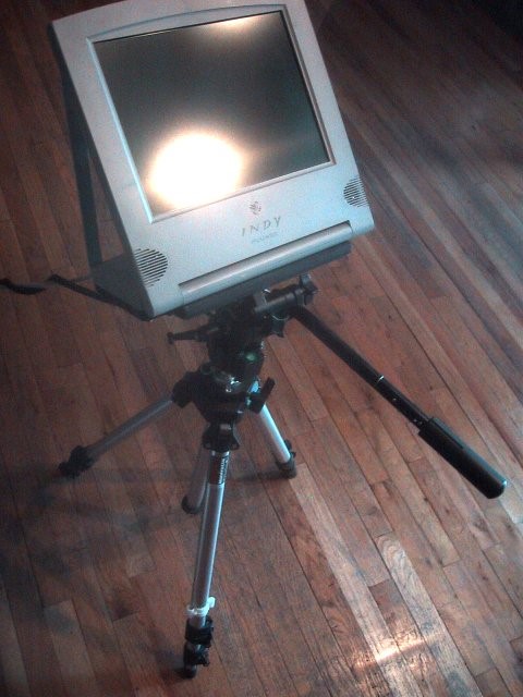
The Cyclops, 1997:
A Cinematographer’s Input Device—Shaped Like the Task
Positioning a virtual camera in a computer-animated world was an equally tedious task, typically solved by algorithms that all the human touch out of the motion; left it floating or rubbery
We realized that real-world cinematographers had decades of experience programmed into their muscle memory—they tapped into it when they tracked a complicated motion using a tripod head’s grip…
…but only when that grip was in their hands. So we put it there.
More
The cyclops mounted a very early LCD display on the tripod to stand in for the camera viewfinder, and used the same angle encoders we used on the Monkey to capture all three degrees of rotational freedom—and we added a slider near their thumb for zooming
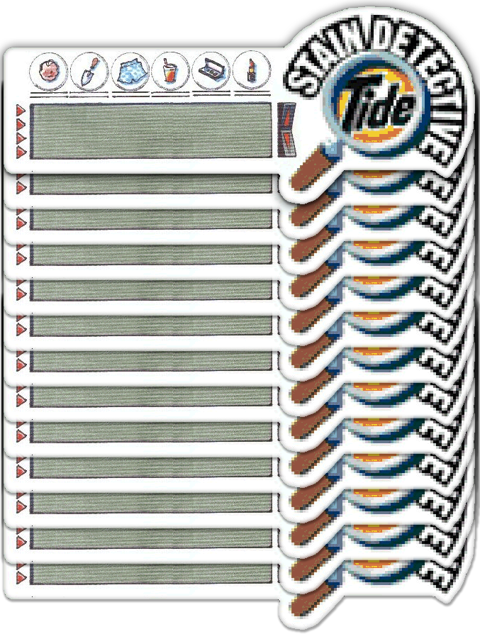
Tide Stain Detective, c. 1996:
Ubiquitous Computing—long before the Internet of Things…
Biochemistry Information Exactly Where It’s Needed: The Laundry Room, with Procter and Gamble Research
This might have been the world’s first widely-deployed task-specific information hardware utility, pre-dating the Internet of Things wave by decades—P&G was to have done a test run of 40,000 units if we could manufacture them for $10 each; alas, we couldn’t break $13
More
Procter and Gamble hired dozens of biochemists for years to discover the best way to remove hundreds of common stains from scores of fabrics with things available in most households—greatly to their credit: not only P&G products. But it sometimes took several steps, and few had access to this very useful, very structured database.
We designed, executed, and programmed the first Tide site. It was one of the first five consumer sites, back when the Web was a new technology. They were so pleased they almost let us talk them into a more interesting technology: Ubiquitous Computing.
Just after the Newton and Palm Pilot general purpose digital assistants came out, and perhaps a decade before any task-specific information-utility devices were made for the general public we designed and engineered this 6″ wide device, thinking of it as an active refrigerator magnet—for your washing machine.
Even the buttons were purpose-engineered: while the inexpensive button technology available was contacts under deformable plastic bumps, we realized those bumps could be shaped like rocker switches when the task was to scroll the four-line LCD display, and like little arrows when the intent was to allow someone to pick a line (existing calculator-like devices had simple round bubbles for buttons).
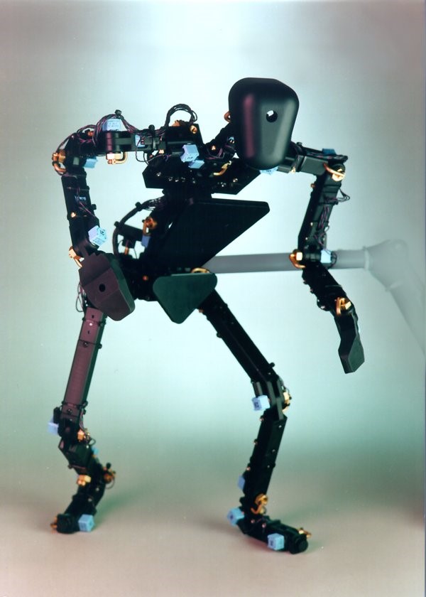
The Monkey, c. 1994:
An Animator’s Input Device—Shaped Like the Task
Positioning a human figure on a screen with a 2D mouse is a tedious task, like trying to be a choreographer without talking to the dancers and directing only with a bar of soap on a tabletop—the input device has nothing to do with the task.
The Monkey came from the simple realization that people couldn’t reach into the screen to move the figure—but we could bring the figure out!
We placed 100 of these devices (not easy for a $20,000 mouse in the early 90s), at studios like Will Vinton (of dancing raisins and M&Ms fame), Industrial Light and Magic, and Disney.
More
An “inverse robot,” the Monkey was a sixteen-inch-tall puppet with high-resolution analog conductive plastic resistors on each of forty joints most often used by the extensive group of animators we polled
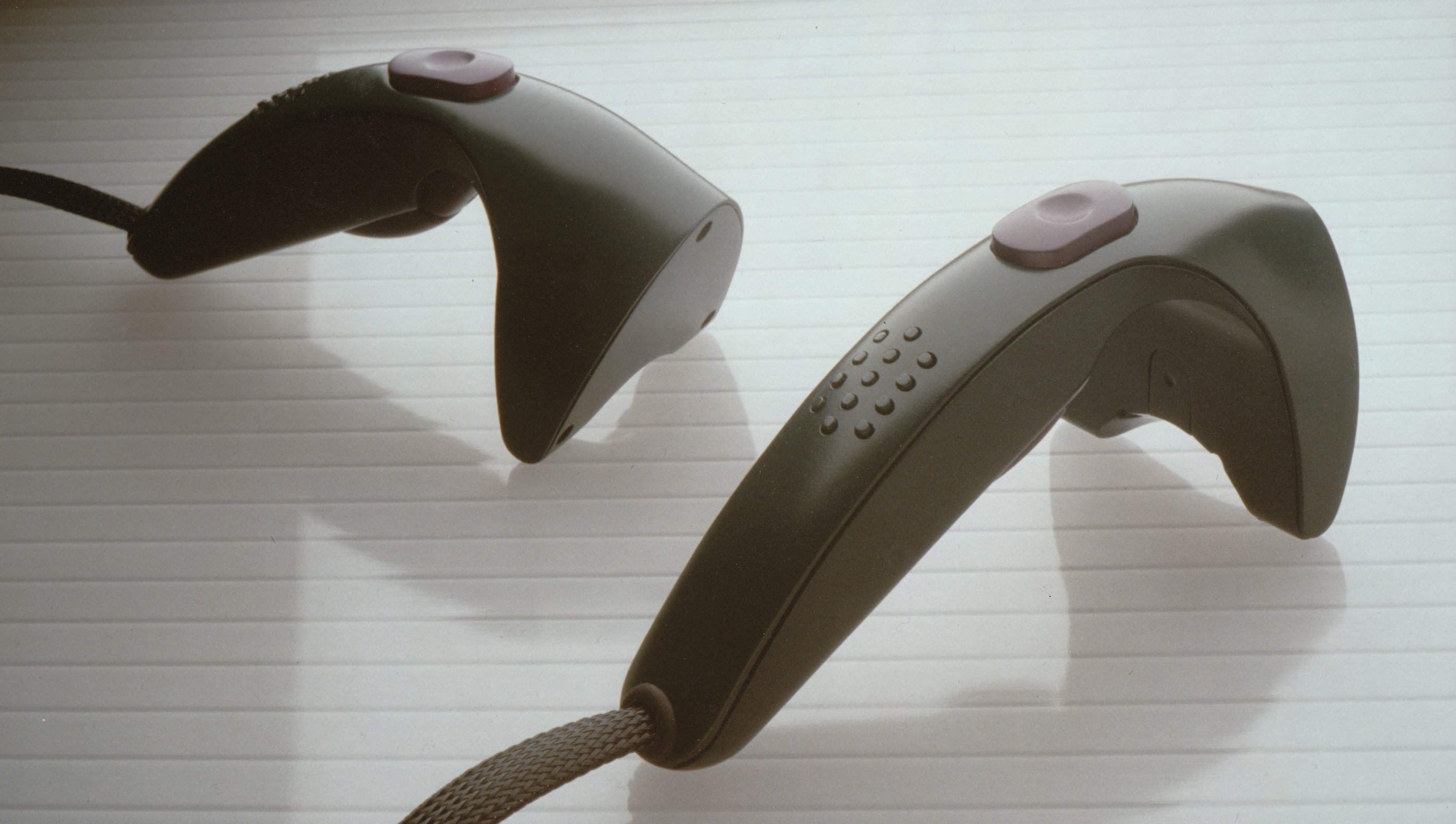
The Cricket, c. 1990:
A Hardware Handle, Input and Output Affordance for Virtual Realities
InScape environments (see next project) had objects in them that needed to be manipulated, so we developed a real-world handle.
At the time all available 3D mouse devices looked like a desktop mouse with extra loops or surfaces to allow one to grab it—apparently nobody realized this was uncomfortable and unnatural. We made the Cricket fit the hand in the normal upright, vertical, angled-forward posture normal for one’s hand when brought to the space in front of one.
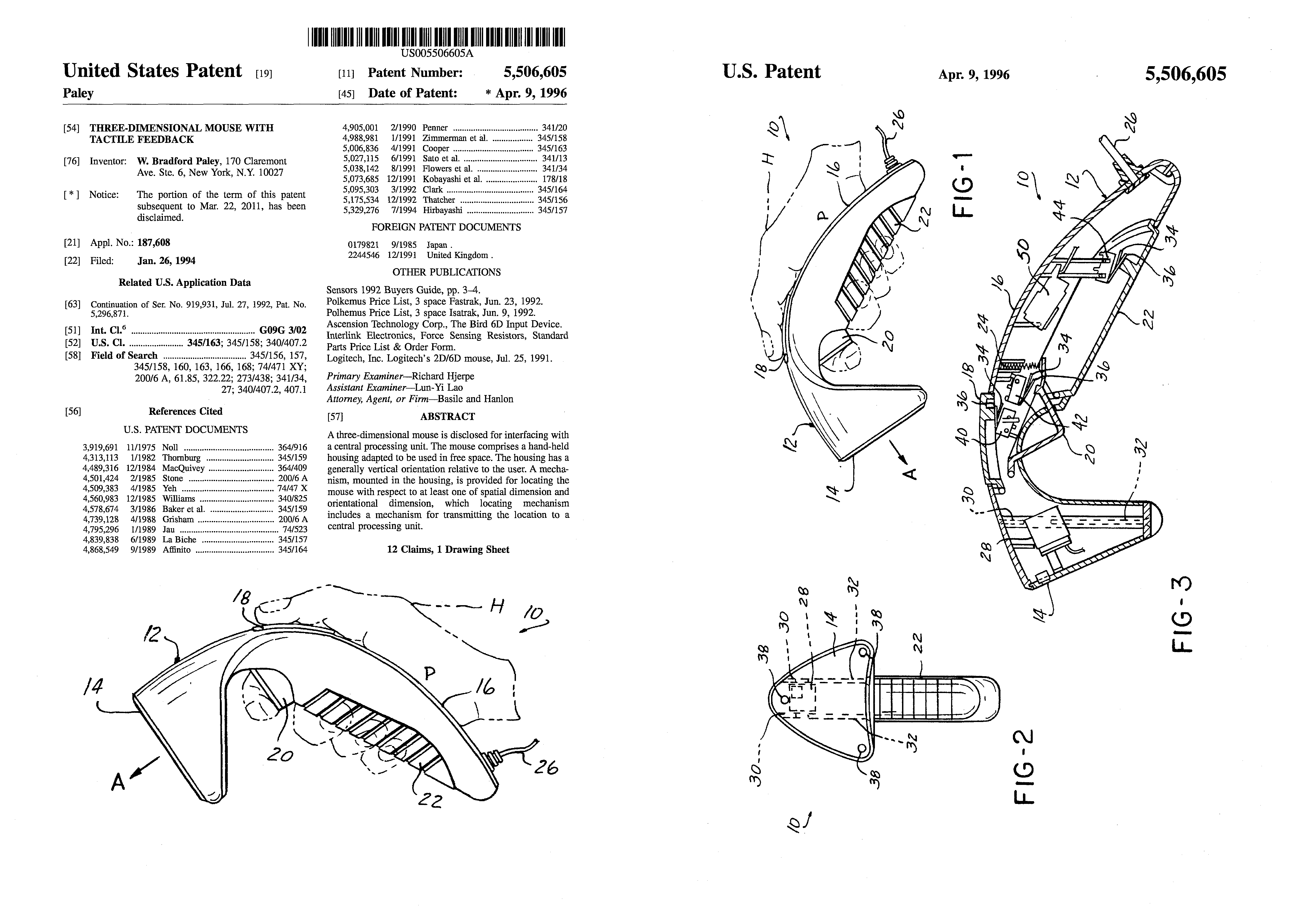
Patent: Three-Dimensional Mouse with Tactile Feedback
US Patent Number 5,506,605 was a fundamental patent in the field, with almost 400 citations (most patents are not cited at all;16 citations is the average). It was cited, e.g., by Nintendo’s Wii device patent: essentially every feature of the Cricket, with a single button moved (our somatically/semantically appropriate grip button became their awkward second trigger); we did not realize the likely infringement until just before 5,506,605 expired.
It won an I.D. Magazine Design Distinction award in their 40th Annual Design Review. It was an honor to be recognized twice (see their feature on our NYSE Broker Handheld) by this bible of industrial design.
More
Research at two universities and with an internationally-known hand surgeon helped us realize that the thenar eminence—the fleshy bump of muscle below your thumb—has almost as many touch sensors as any part of your body. So we added an active tactile feedback vibrator—not just a motor with offset weight, but a custom-modified tactile display that could display any waveform in the range of 0-500 Hz.
Realizing that a primary function was to grip objects, and that the bottom three fingers of the hand are typically operated together, we created a grip button along most of the bottom of the handle
Another key function was pointing at things, and the natural human digit used to indicate things is the index finger; we added a trigger.
This left the most agile digit of the hand—the thumb—free, so we developed a full 3D manipulating pad under it; essentially a flat joystick that also sensed downward pressure and even cushioned slightly downward for passive haptic feedback; Ted Selker independently developed IBM’s similar TrackPoint device years later.
InScape, 1989:
Non-Immersive Virtual Reality
Hardware/Software Combination; research-turned-product
InScape was the first commercially-available non-immersive virtual reality infrastructure: all the math and ideas that went into VR CAVEs, (immersive “holodeck”-like rooms) a year or two before
At the time LEEP optics stretched very low resolution head-mountable displays a few hundred pixels wide to cover as much of your visual field as they could—and we couldn’t find too many real-world applications where the position of your body with respect to the data was the essential issue; architectural walk-throughs and video games perhaps
Instead, InScape wrapped the whole million pixels of a standard desktop display around just the model you were interested in; here: an options portfolio value optimization tool done in our five-person research team at Lehman Brothers, applying VR and scientific visualization well before the term “information visualization” was coined.
More
Custom viewing transforms were built and forced into the rendering pipeline and they were updated in real time to project the viewed volume—generally mostly inside the monitor—onto the location of the physical screen itself; one looked into the monitor as if it were a fish tank and the model was inside, live animated, and available for interaction
Historic note: Developed on the earliest Silicon Graphics computer, the IRIS, containing the first GPUs in the world; we got serial number 000049