NetMap is a visual analysis tool that evokes global insights about the structure of a network, much as a viewing a connectome gives brain researchers an understanding of how billions of links are organized in an animal’s living neural network. But NetMap works with any kind of network data; it works especially well for digraphs (networks with directed links).
NetMap was created to tap into the same spatial understanding that lets us make sense of the vast complexity of brains—but it works for data sets that don’t come with a spatial mapping “out of the box.”
Spatial understanding is a fundamental scaffolding for deep analytic thought. Einstein’s thought experiments, like riding a light beam, drove his insights; the double-helix of DNA was conceived when Francis Crick dreamed of a spiral staircase. This is also true for abstract data; we naturally recruit our vast spatial understanding resources to support abstract analytics. Psycholinguist George Lakoff argues that thinking evolved as metaphors evolved (by metaphors he means a mapping of abstract concepts to things we more naturally understand), and that much of metaphorical thought is spatial. Think of the term “high price”—there’s no a priori reason a large number should be spatially up. That this kind of concept-to-space mapping is so deeply ingrained in daily life supports his thesis.
So we think better in an overview that makes use of space, and not just any arbitrary use of space: one that aligns with pre-existing metaphors helps us think more effectively. Note that this kind of overview facilitates understanding of the network as a whole, revealing structure that is completely unavailable when looking at individual connections, network statistics, or even graph-theory/social-network analysis metrics like centrality or degree distribution. (Similarly: one can’t identify an elephant from an FFT of its image; it’s just not there: the relevant information is lost.)
Our inspiration, the connectome, is a spatial map of neural connections; here axons in the human brain.
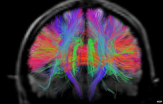
This image, created by the Human Connectome Project, colors them by direction of signal flow. Red axons across the middle are the corpus callosum; it allows communication between our two hemispheres. Violet axons flowing in and out of the page are the two human visual pathways: the ones going along the top (the dorsal stream, or “where pathway”) help us understand where things are in space, ultimately connecting with our motor cortex, and the ones along the bottom (the ventral stream, or “what pathway”) help us understand what we’re looking at, ultimately connecting to our forebrain.
We understand better when we engage both pathways.
This kind of view, simultaneously wholistic and detailed, equally what and where, has supported vast amounts of research in neuroscience; has evoked deep new insights.
Many network display tools max out at dozens of nodes, becoming impenetrable hairballs of links. Others automagically organize many more nodes and links to create beautiful images, but much of their beauty is due to the workings of the force-directed layout algorithms, not the behavior and meaning in the network itself. Arbitrary automatic layouts force domain experts to adapt to the image’s rules. They essentially say “Forget you’re an expert in your domain, we know better. Forget your own mental model of what you’re looking for—re-learn it all following our rules. And if you use multiple tools, re-learn it again for every tool. And if you need node or link details, look elsewhere.”
For abstract data an expert must supply the spatial mapping or it won’t be meaningful—it won’t foster understanding. And parts are most meaningful when seen in the context of the whole.
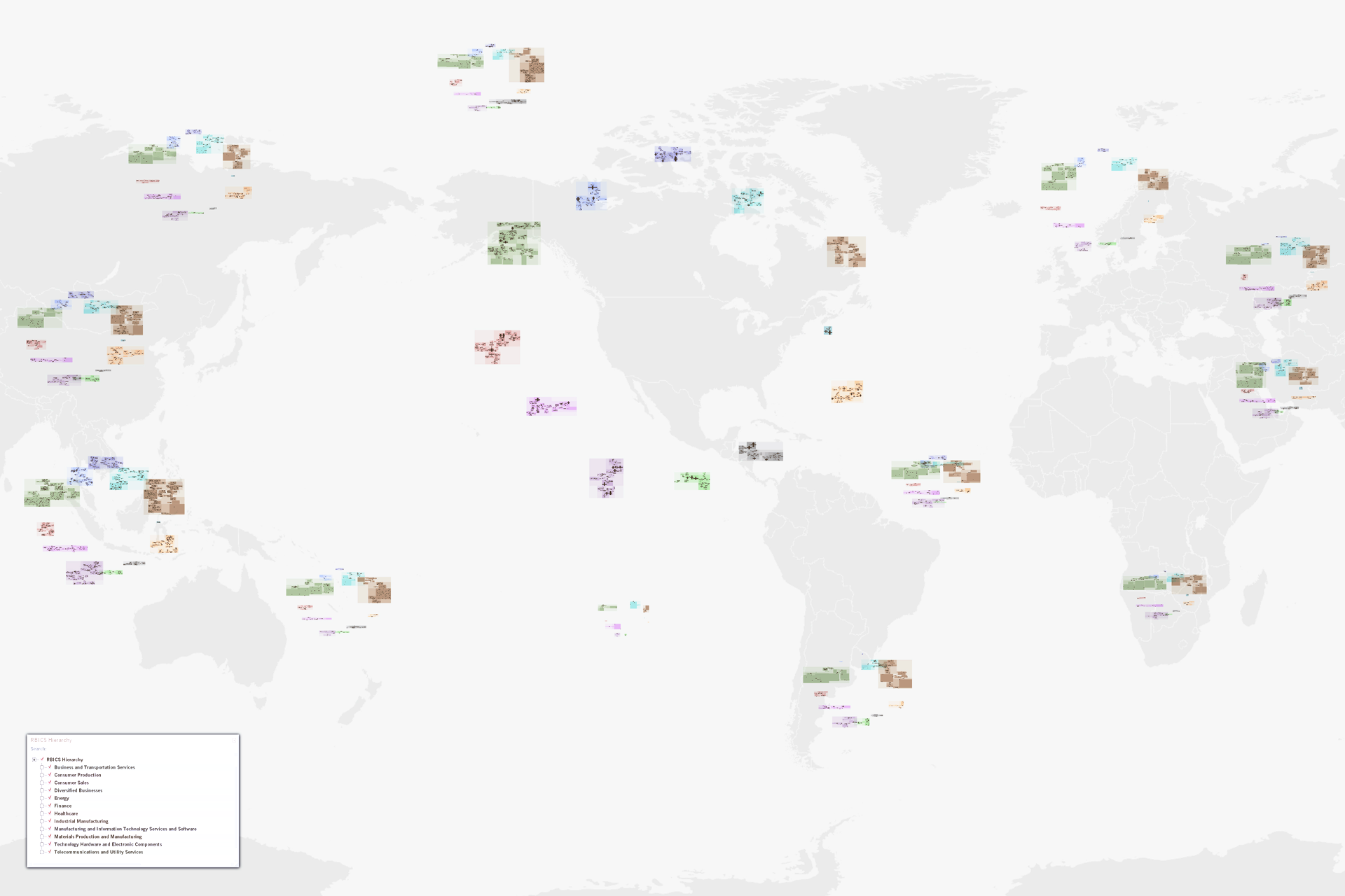
NetMap has two primary contributions:
it enables manual re-organization of any group of nodes at any hierarchical level, and
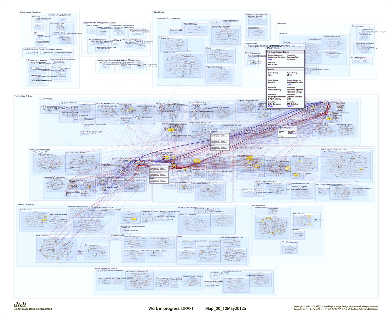
it enables viewing of node/link/pathway details within the context of the whole network.
Hybrid Layout: Combining the Best of Person and Machine
NetMap lets people reorganize the visual representation to fit their own mental model. Thus, when studying supply-chain relationships one might want to map the display to natural expectations of top-to-bottom flow by pulling sectors that mostly provide goods or services (like technology or materials) to the top and pushing those that mostly use them (like consumer sales) to the bottom. We created this spatialization for supply chain analysis, but it works even better when a domain of practice has its own. When experts can think within the context of the mental model they share with peers—when they can think within the model that let them learn their domain in the first place—they can reach second-order conclusions much more readily.
Of course, letting someone manually drag around thousands of individual nodes is no real gift, so NetMap uses the usual, arbitrary graph layout “aesthetic” rules as a starting point, giving people something to work with. It then lets people push any level of the hierarchies where they feel they belong (interactively moving any number of nodes and links), continually enforcing the arbitrary layout rules on nodes that have not been touched—but it retains the relative placement of those that have been moved with human intent. The result is that experts interact with the representation in a natural way, learning about it as they rearrange, e.g., by first dragging entire sectors around to represent inter-sector flow from top to bottom, next focusing in on sub-sector hierarchies to arrange them in whatever spatial layout makes sense at that level of the hierarchy. This is an important point: NetMap lets experts re-use the 2D spatial layout for different goals at different levels of generality, e.g., a world map at the highest level, supplying sectors vs. consumers at the top sector level, and perhaps alphabetically or by size or interest level at lower levels. The subtle analysis-crippling impact of automatic layout schemes becomes apparent if you imagine a corporation’s systems being automatically organized with the C-suite and corporate divisions at the bottom; naturally they need to be at the top or analysts will constantly be interrupting their thought processes to remind themselves the world they’re looking at is upside-down.
Viewing Links and Paths Within The Whole
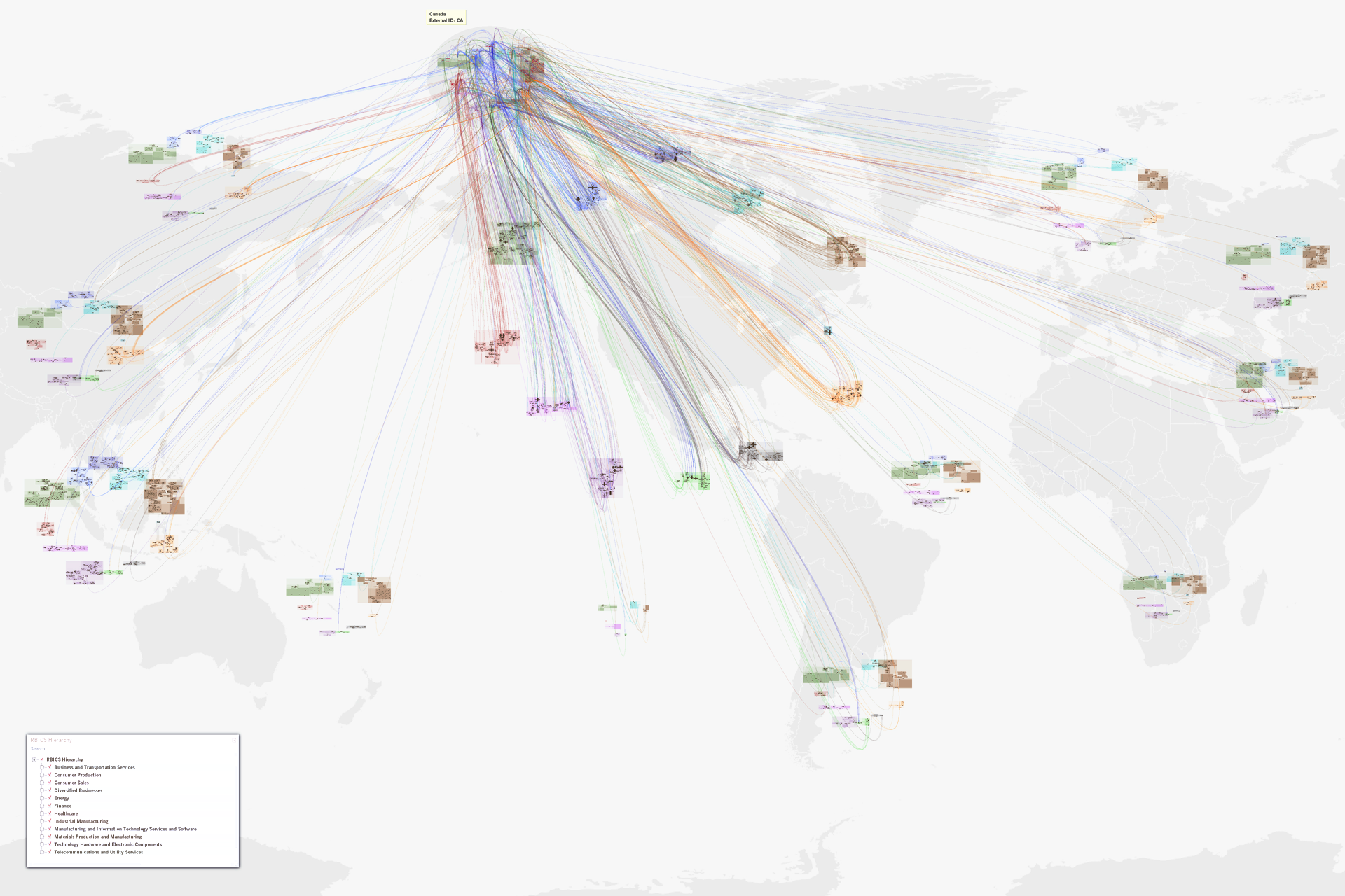
A key point of network analysis is that insights live within the network. Having tools that let you explore the details, yet keep the global context in mind, allows one to synthesize more information and not “miss the forest for the trees.”
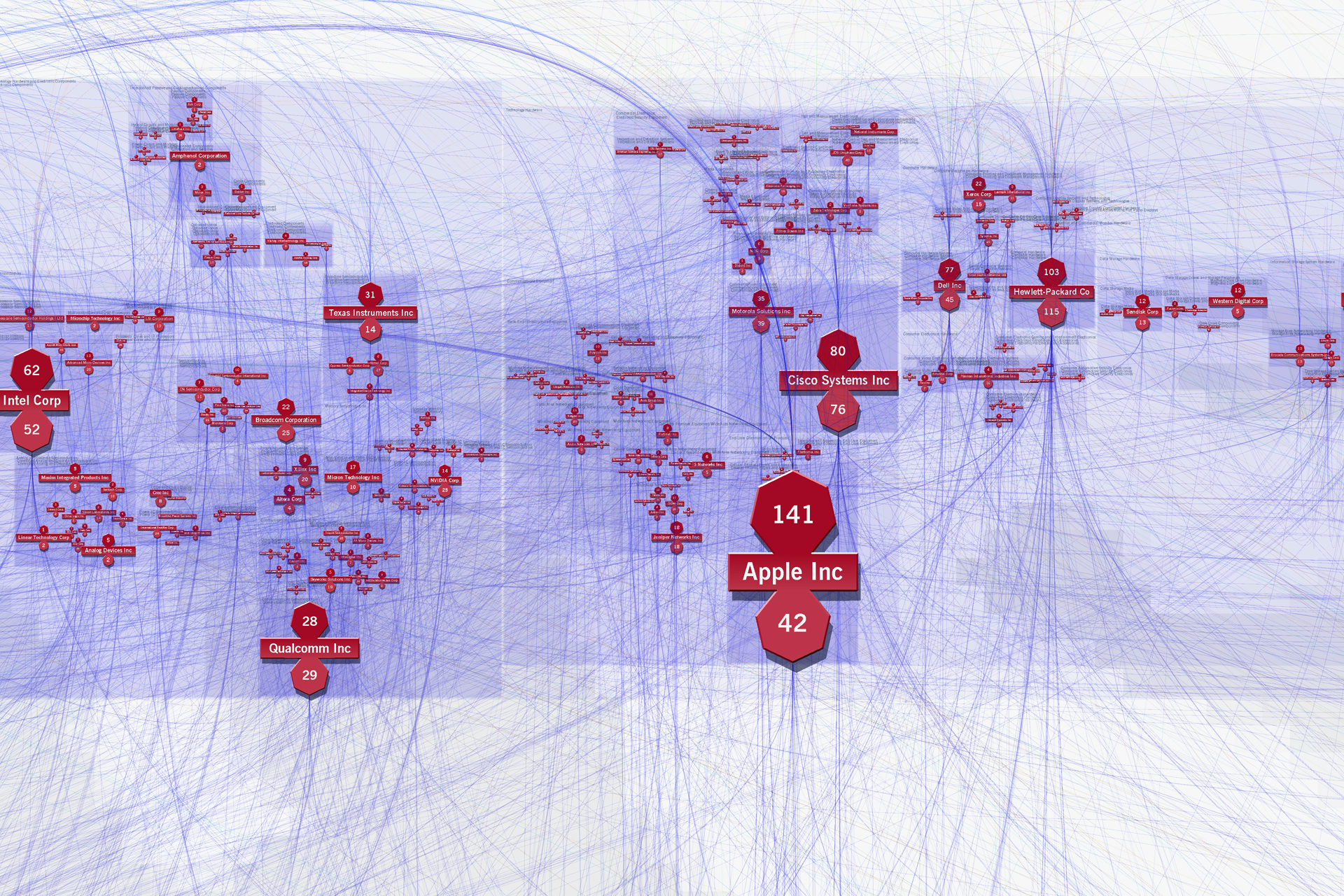
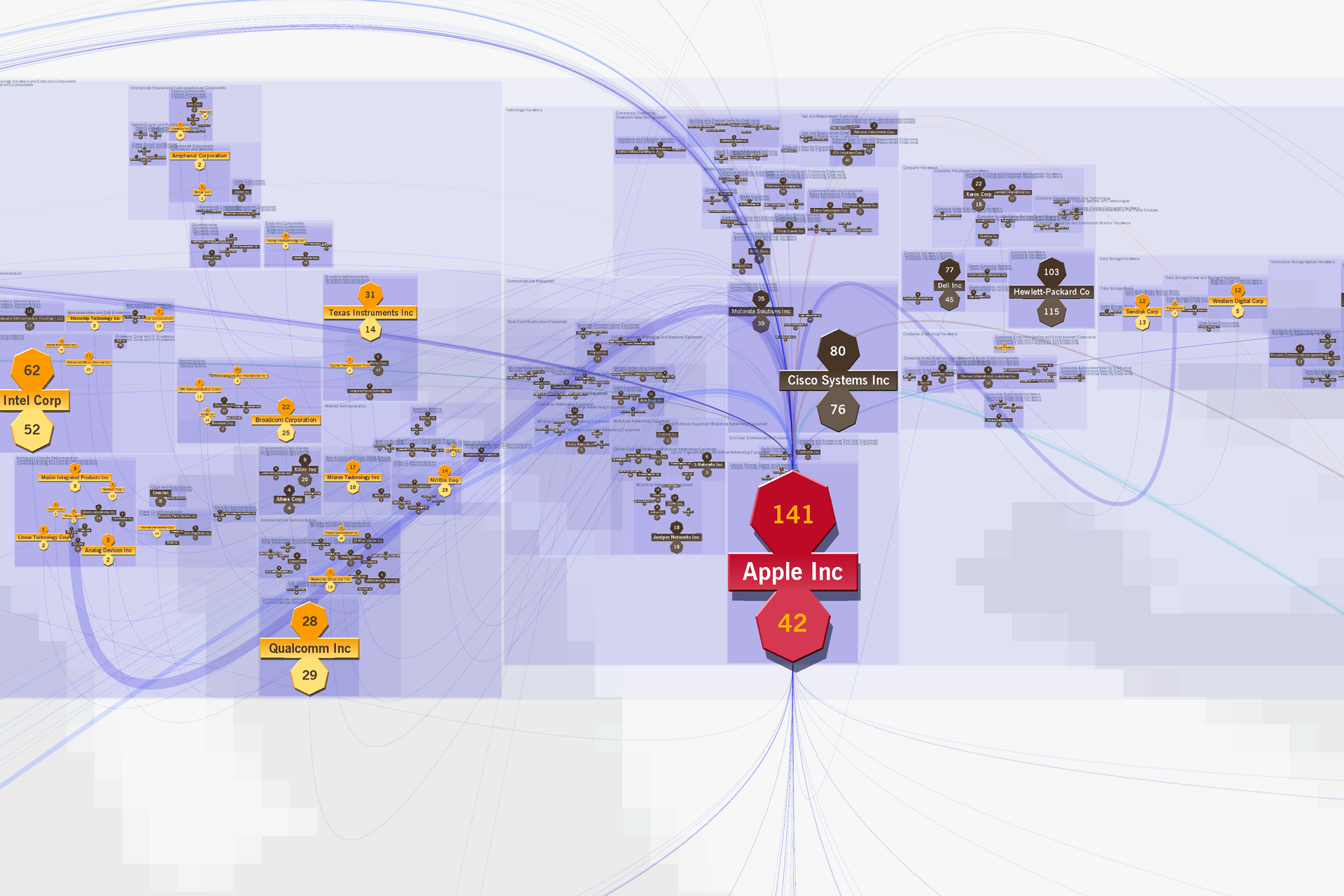
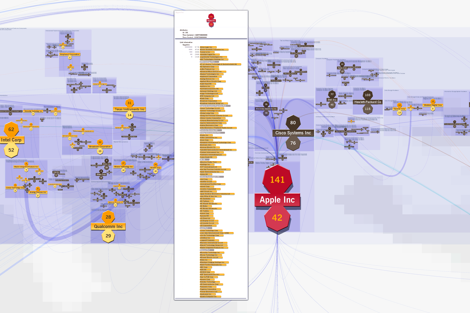
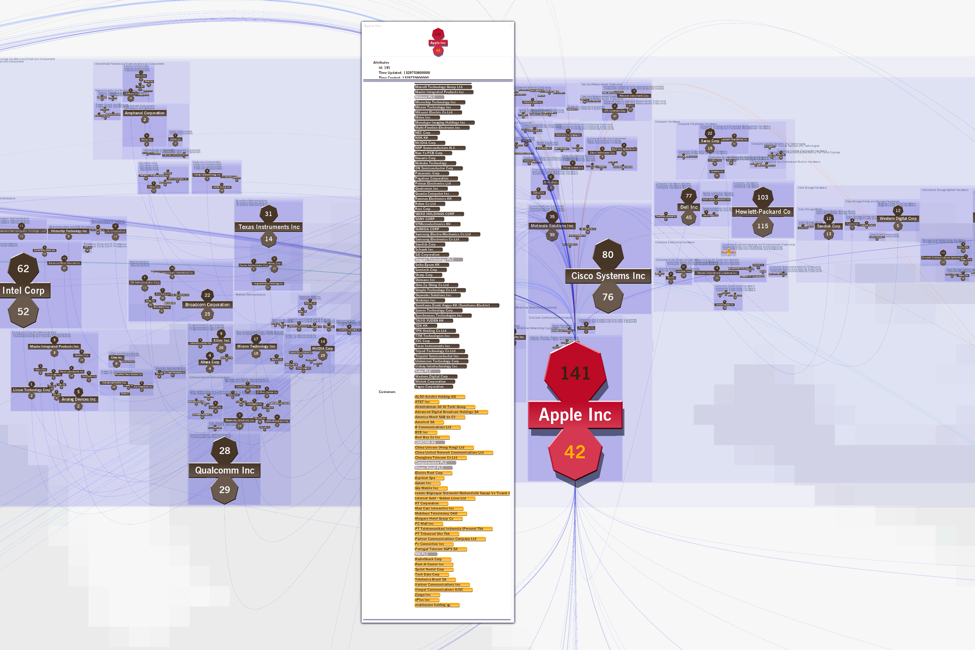
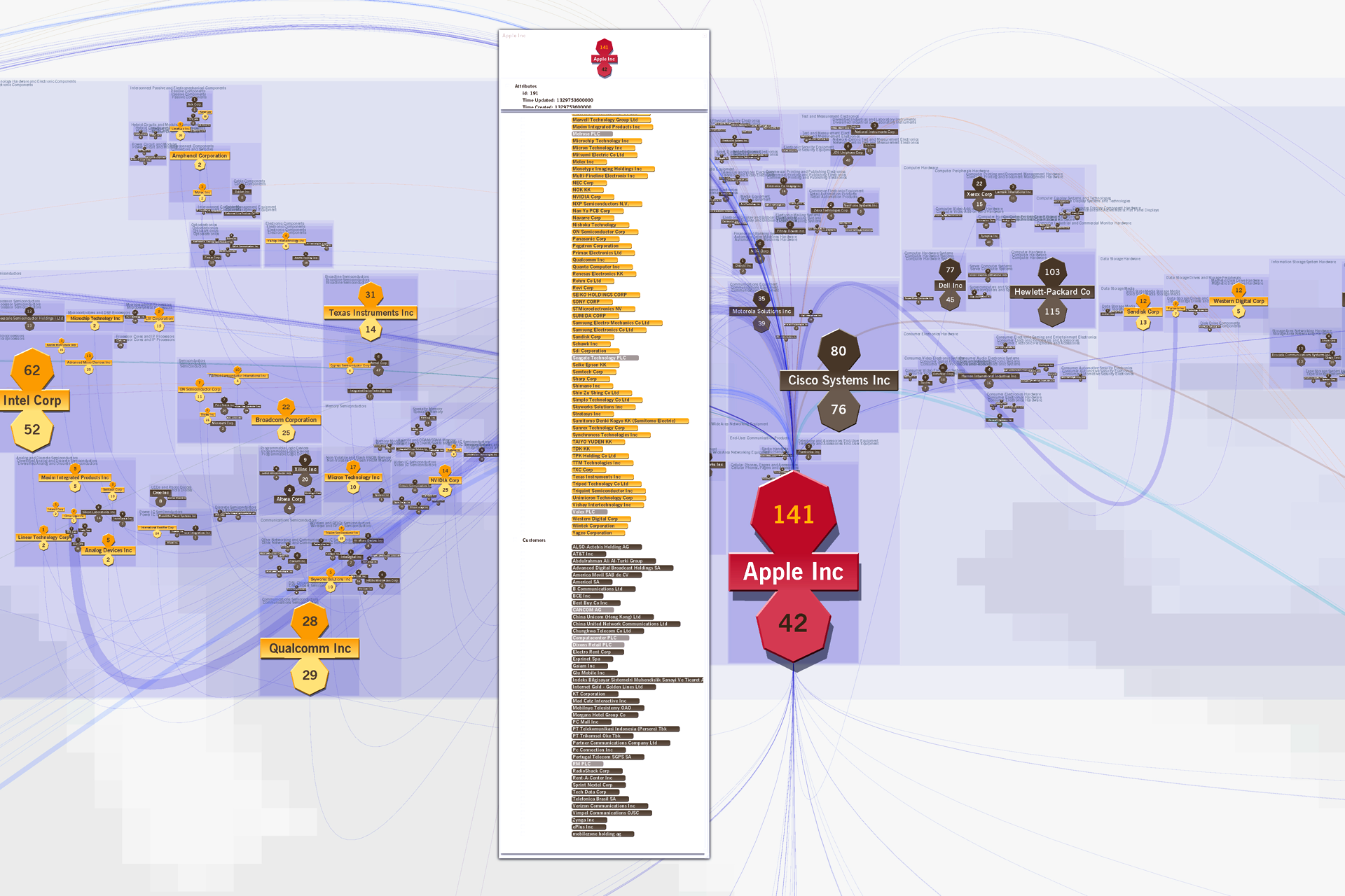
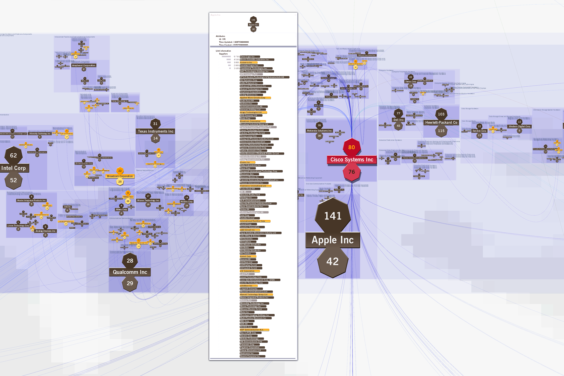
A Walkthrough: Supply Chain Analysis Case Study
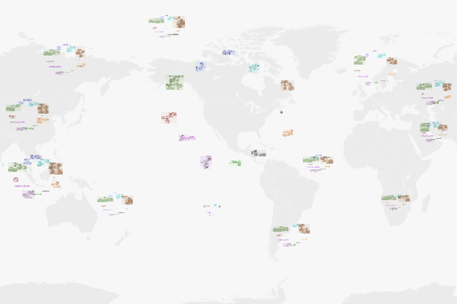
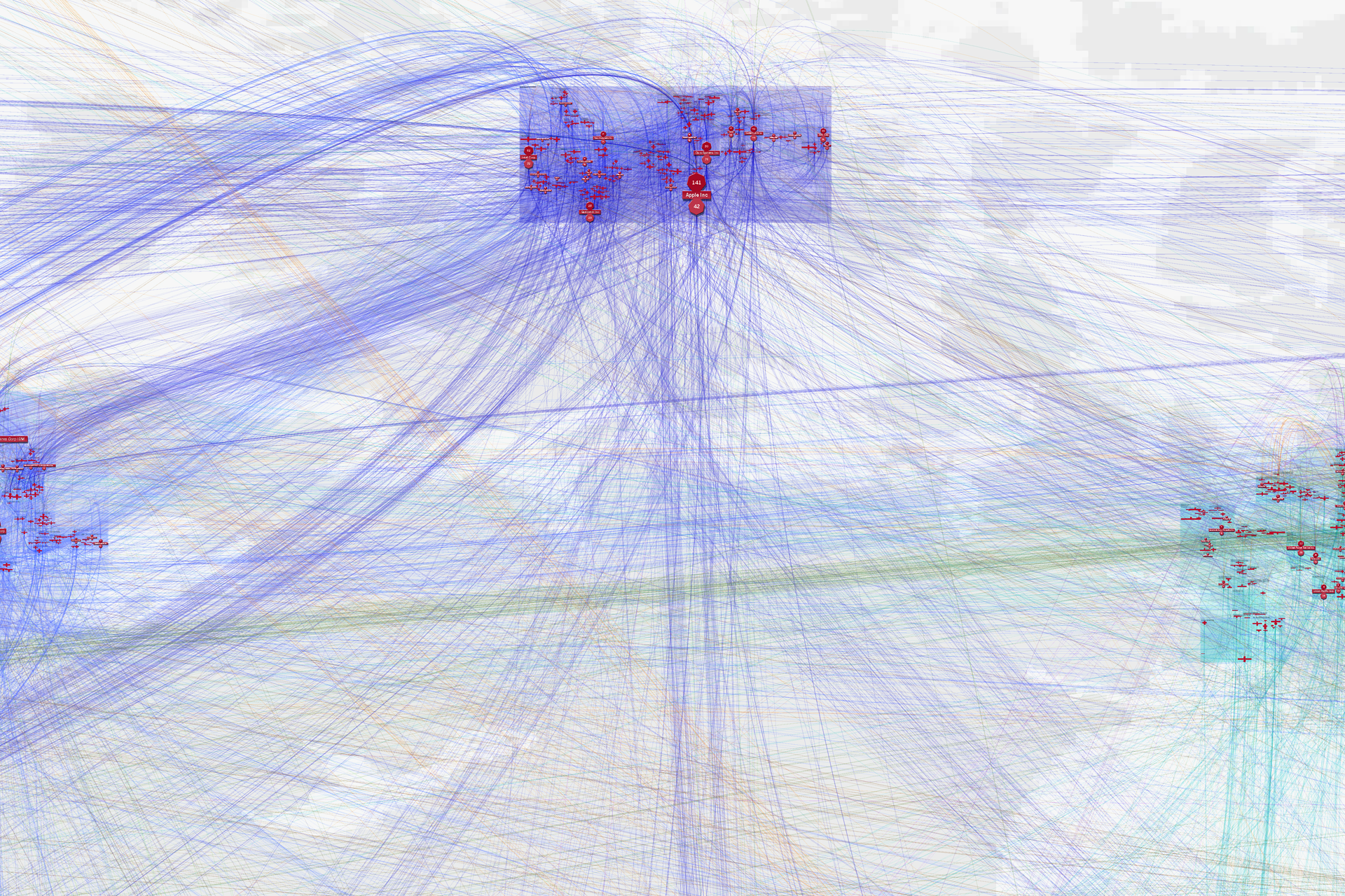
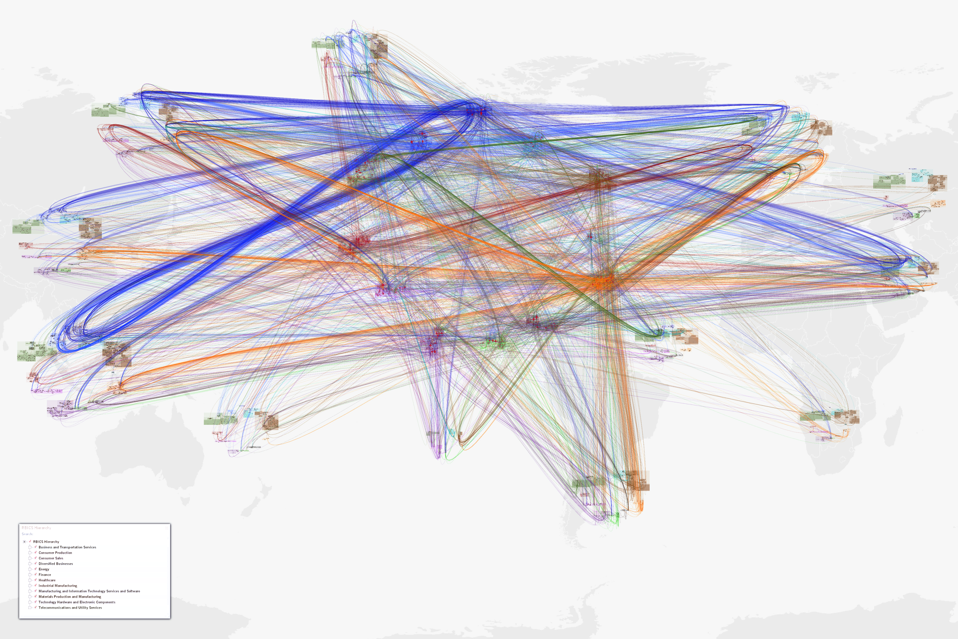
This walkthrough of a visual analysis of supply chain information starts with an overall understanding of global sector relationships, then drills into individually-linked nodes, and finally the overlapping supply chain of two individual companies: Apple and Cisco.
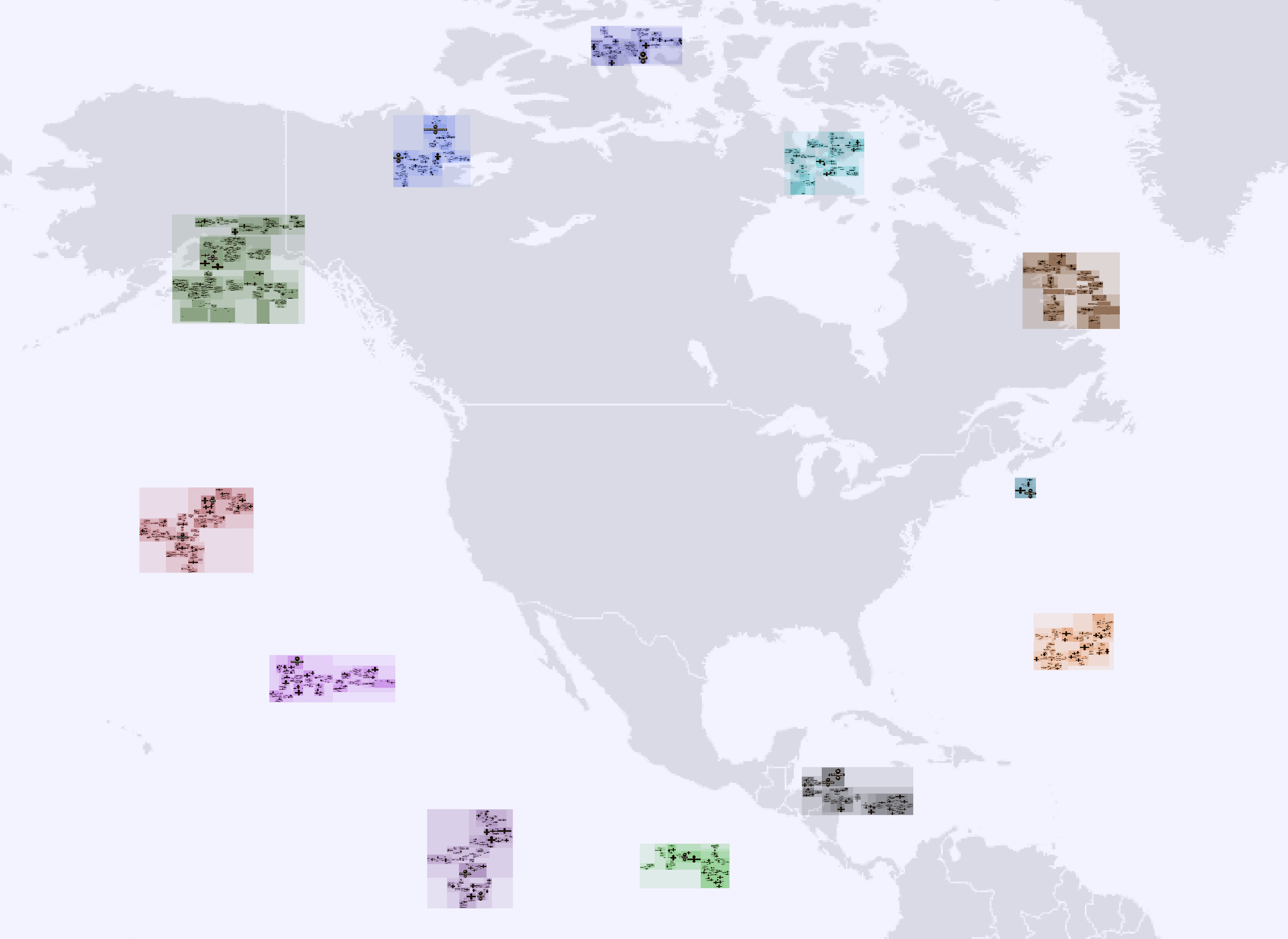
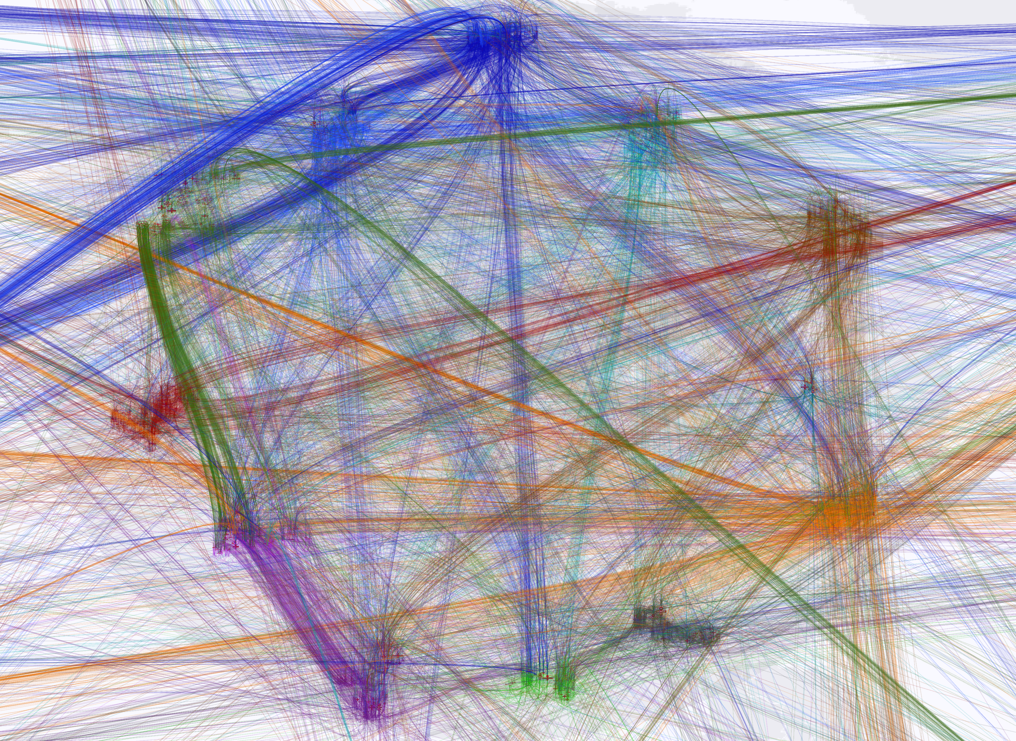
Note how scores of insights are instantly available and can be compared—even in the tiny fifth thumbnail below. There are approximately 6,000 companies, in hundreds of sectors and sub-sectors, and 20,000 links in these images. Yet it’s readable. The nature-inspired shapes of the links is part of what facilitates this: supplies come in the top of a firm, product flows out the bottom, clearly visible at both global and local scales—arrowheads will not do this. For instance, if one knows blue links are technology links it’s clear the US has a healthy interchange with the Asia/Pacific countries, both supplying and getting supplies from it. And when an insight needs to be followed up at the finest level of detail, one can isolate individual sectors, companies, even individual relationships.