A New Trading Venue Needed Humans to Work
In 2006 I was one of the founders of BIDS Trading, a consortium of six of the largest Wall Street investment banks: Goldman Sachs, Morgan Stanley, UBS, Citibank, Lehman Brothers, and Merrill Lynch. We were introducing a new way to trade large blocks of stock without price friction.
Our challenge was getting busy traders to learn a whole new trading model when there were already dozens of competing services on their six or eight large monitors. And ours was at the far end, furthest from their eyes. We struggled to get the interface used by our first customers.
We were not new to trading interface design. Alberta Market Solutions Ltd., the team that created and became BIDS, was the most experienced and prolific providers of exchange trading systems in the world. (The first two exchanges in the world to go electronic were Vancouver and Alberta. This team built the Alberta Stock Exchange systems.)
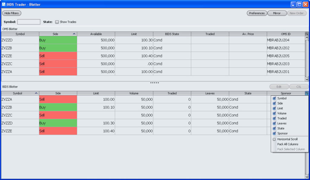
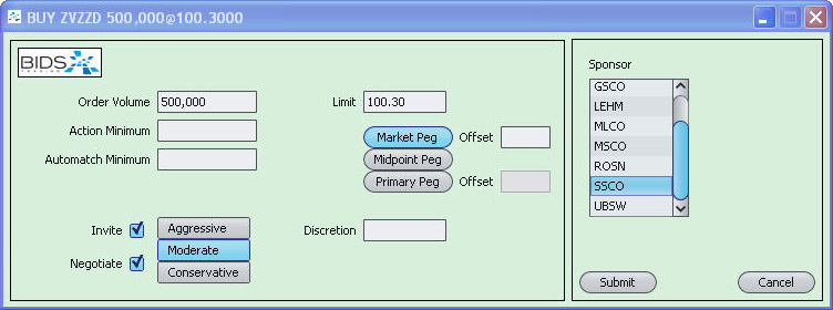

We used all the standard conventions broadly recognized at the time, not dissimilar to what’s in use today. What was different was this time we were not the center of the market, and we were asking a very busy and impatient group to do something new and different. We were not breaking through.
We were at risk of failing.
I met Brad the next year, saw his portfolio, and was astonished. I knew I’d found the key to getting BIDS accepted by our market.
To get Brad’s very different approach accepted by our experienced development team was another matter, but our head of development suggested that he show the value by bringing it in-house: he should teach us an abbreviated version of his Columbia course.
After session two our chief architect, who’d been very skeptical, went up to Brad and said “You’re showing me we’ve been making UIs that express the structure of the data, not the mind of the user—and there’s a complete object-oriented architecture on that human side we need to understand.” Brad said “Exactly.”
Our whole team got the point that our work was only meaningful if it fit the minds of the traders—and worked the way the traders themselves perceived their work.
Brad then led a redesign effort that resulted in a key client telling us he’d “never seen an interface improve so much, so fast.”
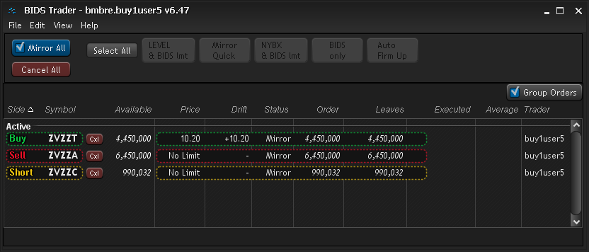
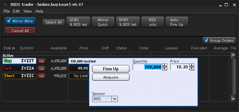
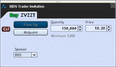
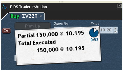
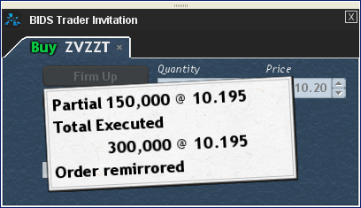
The new interface did get BIDS widely adopted by the trading community, precisely because it brought the trader’s ideas out in front of the UI rules and data structures, and made each opportunity to trade obvious. More critically, it made what the trader needed to do (something new to them) visually explicit, and eventually effortless.
A few years later, a technology refresh was needed. When an important client was told a new version was coming, he told our team “By all means—just don’t change the way it looks.”
—Paul Hanson, a founder of BIDS Trading


