Necessity is the mother of invention.
Here’s how that actually works.
Research in a vacuum will return just that, nothing useful. To augment mental processes properly we needed to observe the best in action. And understand exactly how they work.
Analytic and decision-making processes are among our most advanced thinking. So we sought out disciplines that attract and reward effective people who do them constantly; disciplines that have clear, objective success criteria. Cultural evolution had taken them as far as they could go—within the limitations of their tools. This made the limits obvious.
Then we pushed those limits.
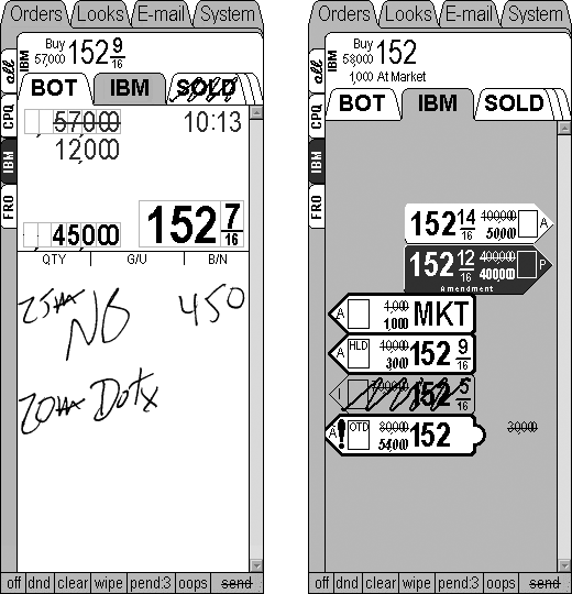
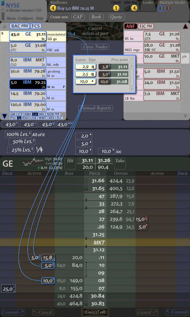
Goldman Sachs, 1998: NYSE Broker Handheld
Key feature: Invention of the “information object” (right) representation to reduce cognitive load reading orders. It reassembles order attributes (usually torn apart and spread across a grid’s columns) into an illustration of the thought entity actually living and working in expert minds.
Andy Silverman, then broker for GS: “It’s hard to let go of something you’ve been doing for a long time and do something new. Brad’s given us an ergonomic shorthand. You don’t need to learn it, you just grab it with your eyes. The bottom line is that it makes the broker more productive. And that makes the firm more productive.” (Quote: I.D. Magazine’s June 2000 four-page feature article on this project)
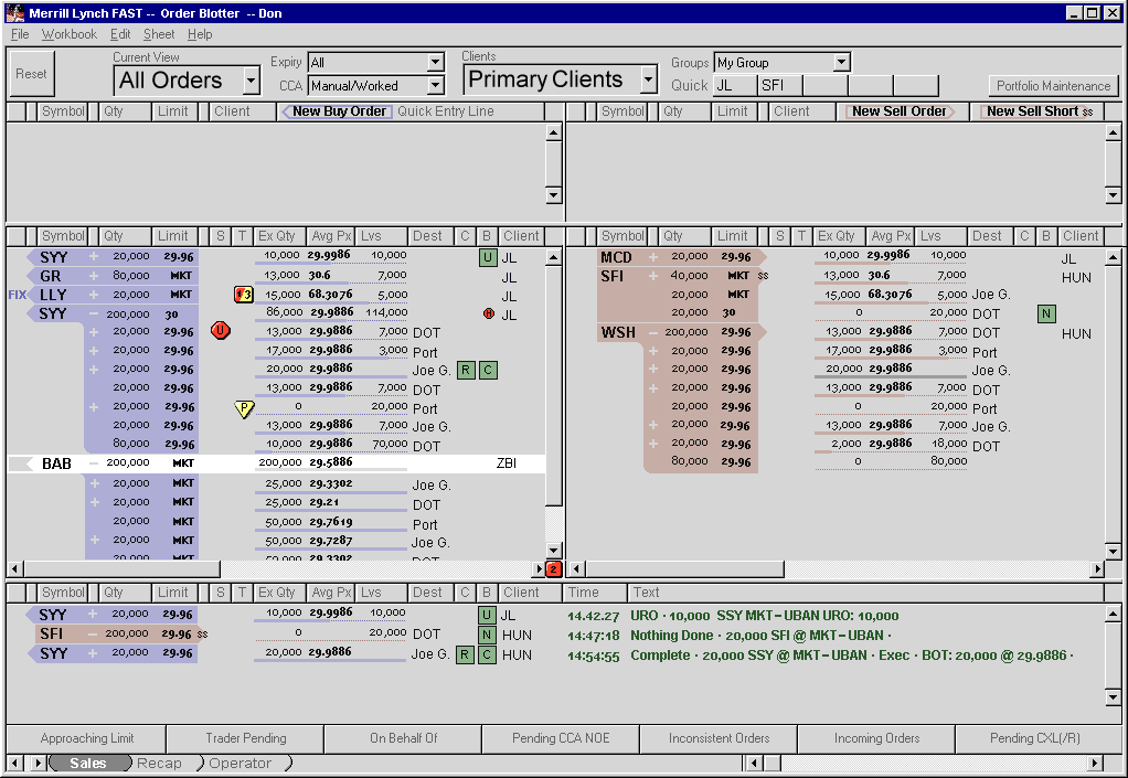
Merrill Lynch 2000: Equities Trading System
Key behavioral advantage: Created clear visual trade tracking within the sales trading blotter: every trade’s fills and state was immediately visible; added “unmissable” alerting visuals for critical operations
Key accessibility advantage: Conventional (red/amber/green) colors were used but tuned to have the proper differentiation and visual saliency for color blind people, about 7% of men.
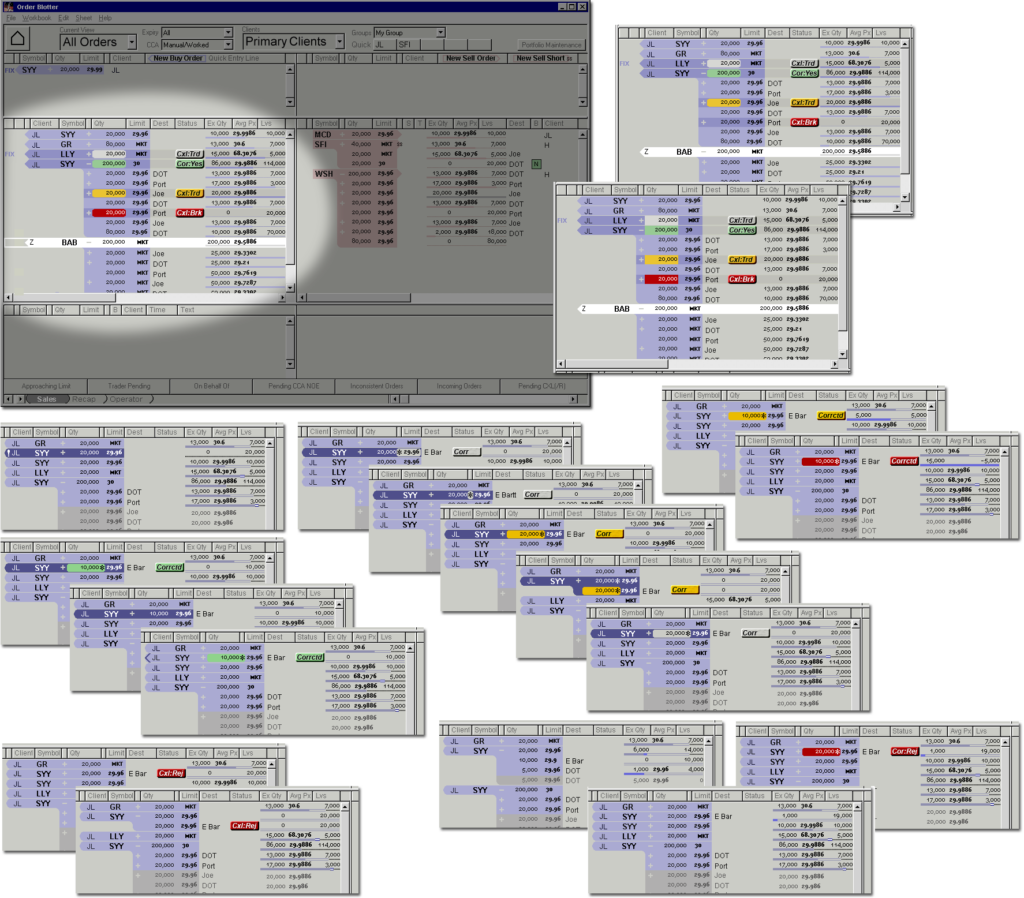
Key development cost savings: This is an early application of the Paper Prototyping stage in our design methodology: by illustrating every significant system state, then hand-simulating the system in front of a trader asked to pretend they were using it, we caught bugs immediately and added enhancements before both coding and spec-writing—this saved huge amounts of effort, money, business-side frustration, and calendar time
Perry Metviner, Managing Director, Equities Trading Devlopment: “I worked with Brad at Goldman Sachs and thought his jet-cockpit-like ergonomic approach was normal—until I tried to find a team in London to do the same. We looked at everyone we could and didn’t find a fraction of the background, insight, or capabilities. I was happy to be able to use didi once I got back to the States. The resulting interface clearly made our Equities Sales Trading more productive as well as happier using the new system.”
Financial Workbench 1998-2002: Financial Management system
Key advantage: Even at the dawn of commercial financial tools on the Internet, we shaped the tools around the existing processes financial managers went through, rather than coercing experts into Web practices. We recognized three primary motivations in our first target experts, Personal Wealth Managers, and cast them as the questions implicit in their minds—for instant recognition. Then we simply built a tool that helped them answer each question, naming the tools “What’s Changed?”, “How Should I Compensate?”, and “Looking Forward.”
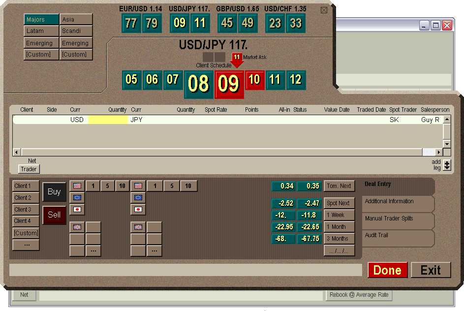
Morgan Stanley 2002: Foreign Exchange system (both sales and trading)
Key advantage: Created “unmissable” alerting visuals within the trading blotters: dangerous situations were made impossible to miss by visual layering; the risk of trading with a client at a deficit was reduced by introducing a real-time market feed that made the execution buttons look dangerously red.
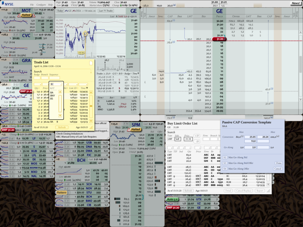
New York Stock Exchange 2004: Specialist Workstation for Hybrid Market
Key advantage: Put up to four times as much information in the same screen space, more readably if information is measured by characters on the screen; over ten times as much information on the screen if measured as inferences that the specialist can make.
Lou Pastina, Executive Vice President: “Brad Paley looks at the world differently, and provides a perspective in design that is innovative and intuitive for users. He is able to combine his unusual perspective with years of proven successful design and implementation to deliver transformational change with the mastery of a minimalist.”
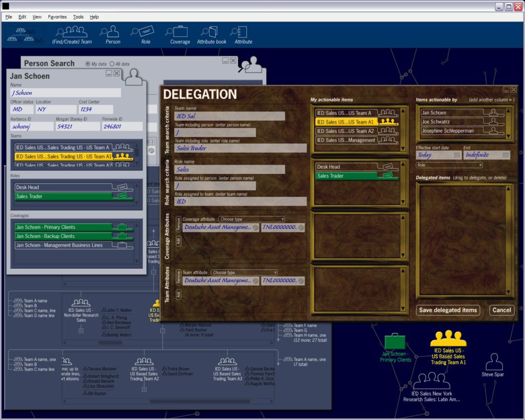
Morgan Stanley 2005: Internal organization chart, HR, access control system
Key transformation: Extremely abstract representations of complex relationships among teams, people, roles, permissions, securities, systems, clients and other entities were made concrete; drag-and-drop easy to modify.
Cognitive Engineering Principle: map data back to the real-world elements and behavior they model. We used common, recognizable screen objects to evoke real-world entities (e.g., a person’s outline for a person, a briefcase for the data needed to do a specific job). Then we carefully matched the expected real-world constraints to the system’s data constraints.
For instance, it’s common sense to drag a person into a group, or put 3-holed paper (data type) into a binder, then to put a binder or piece of paper into a briefcase—but not to put a person in a briefcase. We took mental operations out of the realm of abstract UX forms and invisible, must-be-remembered associative rules and re-casting them as expected, “obvious” relationships among known things; this reduced errors and simplified learning.
Operational Impact: 50+ Web-based screens which could only be operated by the program developers were reduced to six objects & three views which were used throughout the firm.
New York Stock Exchange 2006: Broker Handheld (design and prototype)
Key advantages: Sped up brokers a factor of fifteen to twenty (7-10 seconds was reduced to half a second for the fastest brokers) in the key process of doing a “refill” order; greatly sped up cancel-and-replace operations for moving one or more orders to a different price point while simultaneously improving strategic thinking and reducing risk.
Gordon Charlop, then President and CEO of WJ Dowd: “Apart from his great skill as a designer, Brad has a unique ability to develop a design by listening and understanding what clients want and need. At the NYSE, Brad was asked to design a state-of-the-art portable order management system. His constituency was a broad group of high level brokers with disparate needs. By combining his communication skills with his design knowledge, Brad developed a remarkable product.”
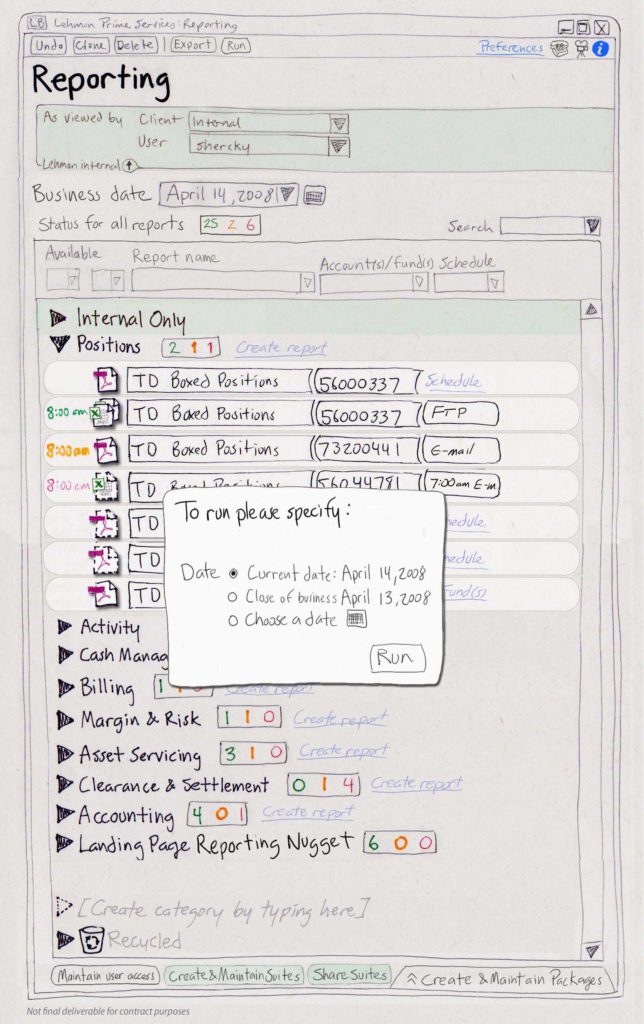
Lehman Brothers 2007: Prime Brokerage Web site, client Report Access system
Key advantages: Vastly simplified definition of customizable reports and automated report delivery by clients and internal staff, organized immediate access to financial reports; we’re told the project manager later repeated the innovative ideas at Citibank.
Perry Metviner, Managing Director: “Our Prime Brokerage Web site was complicated but the didi redesign made it both simpler and clearer. The didi approach made our highly-functional (but complex) client-access Reporting system much easier by applying unique didi information-object technology, and the paper prototype-based design process we learned from didi saved us uncountable development hours and business-side frustration.”
Earl Industries 2008: WorldMerge, an Intelligence Community analyst’s workstation prototype
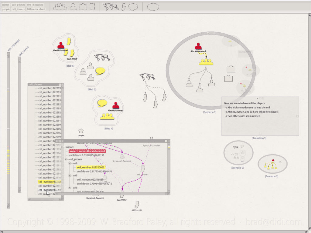
Key innovations: New interaction techniques allow instant association of disparate classes of data objects in “blobs” and relationships between objects with categorized links; the design allowed several analysts to work together, in the same room or globally; the concept of two-sorted multiple logical analysis was directly visually supported; “scenarios” organized information related to a developing “story”; and different stages of the formation of a story are represented in an active visual audit trail.
Ted Goranson, Project Director: “We came to Brad because common sense in cognitive flow is apparently rare. We needed someone to guide some conceptual thinking very early on in the project and have found his approach invaluable.”
Rosenblatt Securities, Penserra Securities 2009: Custom advanced charting package
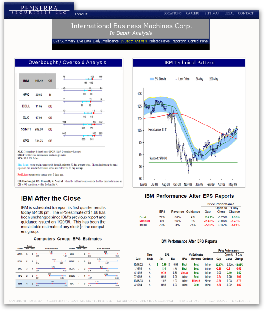
Key advantages: Integrated interactive Java Applet charts quietly into a Web page; allowed them to zoom out of the page for closer analysis; innovated point-query and curve comparison techniques to reduce misinterpretation risk based on visual/cognitive principles.
Dick Rosenblatt, founder of Rosenblatt Securities: “The Rosenblatt Securities business model requires an innovative, often unique, approach to the trading process utilizing the best technology. Brad not only takes the time to understand our ideas, but creates amazing technology to make them a reality. The result is functional, easy to use, and visually appealing. The fact that Brad is a pleasure to deal with, and works at close to light speed just adds to a positive experience at every level.”
BIDS Trading 2009: Trade Blotter (trade input, tracking, alerting)
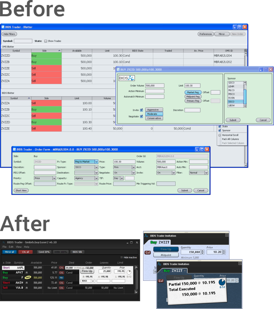
Key advantage: Combination of three screens/operations into one; visual clarification of the transaction-related business structure this dark pool offers to clients.
Tim Mahoney, CEO: “It is a transformational piece of software for us. The first generation was clear and easy, but it was not nearly as simple as it is now… If you were to look at our version 5 and version 6, other than the fact that it says ‘Bids’ on it, you wouldn’t know [it was the same system].” (Quote from Dealing With Technology article; August 3, 2009)
Fixed Income Broker 2009: FFI, A broker-centric trading front end prototype
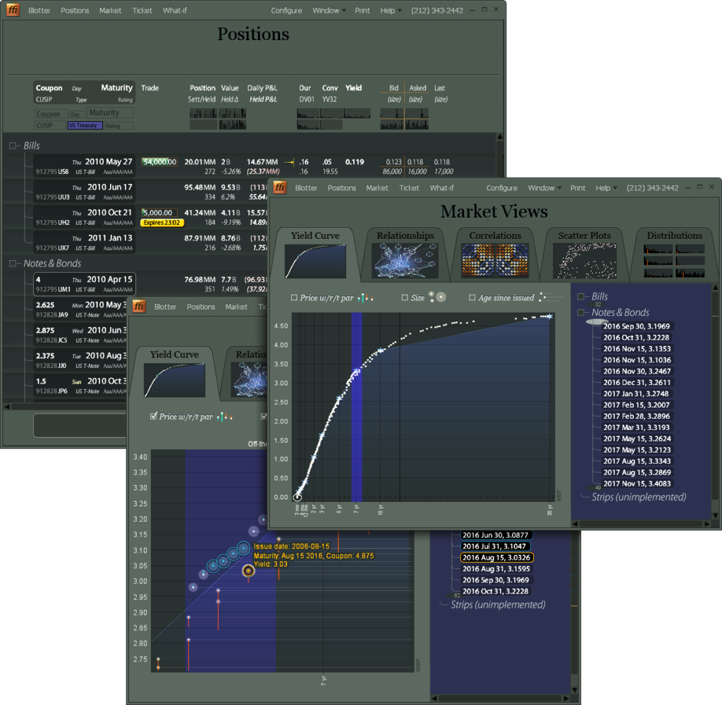
Key Update: Improved every individual screen layout to better follow expert trading behavior, adding impossible-to-miss alerting and second-nature multi-key filtering.
Deliverables: A complete system redesign, plus working and tested source code for an enhanced Java widget set that simplified visual presentation, introduced information layering and other innovations.
JP Morgan Asset Management 2010: XTL, equities trading for extreme trade lists
Description: A fully-functional prototype of a game-changing Execution Management System front end, starting a transition to also cover Order Management System functionality for “portfolio trader” roles.
Key Cognitive Engineering Architecture Change: Equities consoles, plus task-specific tools that gather all the data necessary for a task and allow all necessary actions to be taken within each tool. This obviates the need for a four- or six-screen setup—most operations could now be done on a tablet. Read the white paper about how refactoring the trading desktop changes everything.
The tools are direct visual illustrations of the cognitive steps an expert takes to complete a task; as such they look completely different from one another; this facilitates faster mental task-switching.
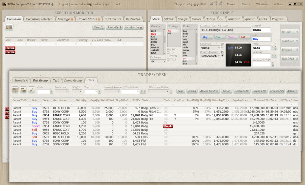
Tora Trading 2011: Redesign of entire EMS front end
Key Update: Improved every individual screen layout to better follow expert trading behavior, adding impossible-to-miss alerting and second-nature multi-key filtering.
Deliverables: A complete system redesign, plus working and tested source code for an enhanced Java widget set that simplified visual presentation, introduced information layering and other innovations.
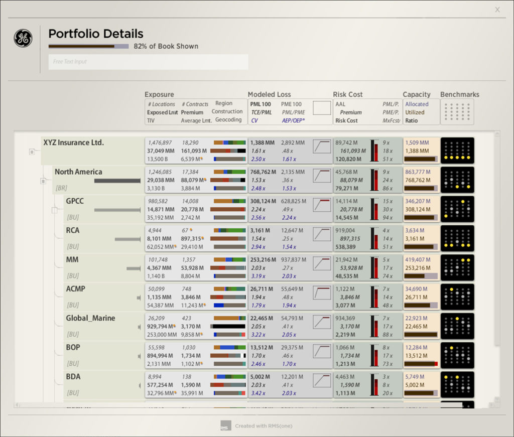
Risk Management Solutions 2012: Portfolio management and risk analysis workbench
Key Transformation: Refactoring of the entire “Cat Analyst” interface, reworking a high-cognitive-load data-centric screen design in favor of task-centric tools. In the process dozens of entities involved in risk analysis were made more concrete and so easier to manipulate, think about, and act on; this let screens display and integrate more information yet be more comfortable and evoke more insights.
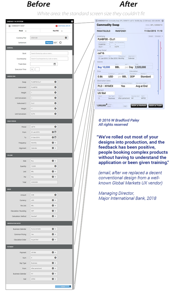
Macquarie’s Energy-Trading Division 2016:
Our “Rescue” From a Design by (UX Vendor) Sapient Global Markets
Key Transformation: Rather than slavishly following tidy-making UX design rules, and blowing way beyond the target screen area (faint white background at right), as the previous designers did, we listened to how the traders spoke. This let us give them back the ability to think like traders, not data-input operators.
Critical Interaction Innovation: Our “Composite Fields” are the visual transcription of how experts speak—and therefore how they think. Each composite field is a thought “chunk” (a fundamental finding in Psycholinguistics). Each is instantly recognizable, so it can be reused and understood in different contexts; the system automatically generated over 30,000 screens from these intellectual building blocks. Composite Fields are tiny in space and in cognitive load compared to the conventional, wasteful UX approach. And of course, this generalizes: every domain of practice has its own recognizable chunks.
Both screens here have the same information: the previous team’s industry-standard approach was systematic, and deceptively (confusingly!) “clean.” Ours is articulated around trader thoughts, and that provides an intellectual scaffolding that helps them have second-order insights more easily.
Managing Director, Trading Technology, from an unsolicited email: “We’ve rolled out most of your designs into production, and the feedback has been positive, people booking complex products without having to understand the application or been given training.” In VC/startup-speak: 100% user satisfaction with no training and no support costs! Unheard of. If anyone else claims this, ask them to detail the cognitive mechanisms that let them—we can.
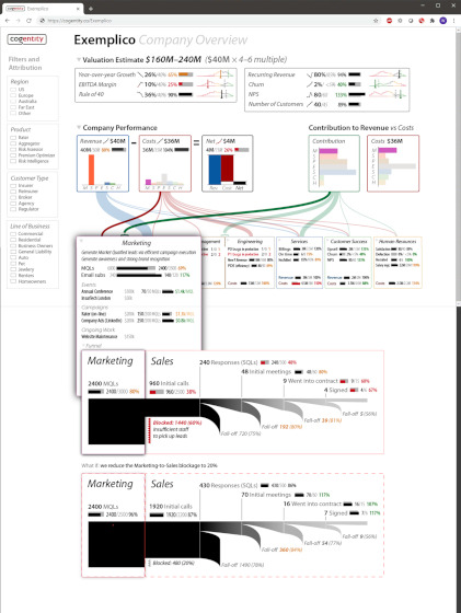
Financial Startup 2019-2021: Cogentity
Scope: Creation of startup aiming to bring the clarity of Business Mechanics to software startups, scaling to all corporate classes. We developed all business strategies and products.
Defining Value: Business Mechanics brings instant, visceral clarity to the operations of an entire corporation, showing relationships between Revenues, Costs, and our essential newly-introduced concept of Contribution.
Unique Offering: The Cogentity real-time visual model of an operating corporation allows you, if you’re a CEO, to “Discover Your Corporation.” It also gives concise and accurate overviews, with instantly-available details, to other roles in the company, helping them to cost less (or bring in more revenues) while contributing more to, e.g., KPIs—a primary focus for software startups. When shared with investors it can build understanding, trust, and therefore investment.
Elimination of False Complexity: This video walk-through, from a keynote address in 2020, demonstrates how dozens of pages can be reduced to a single illustration—and simplfy understanding. Common presentation tools introduce a layer of dangerous complexity by shoehorning a relatively straightforward story into off-the-shelf presentation modes, like a PowerPoint deck. A corporation is complicated (many moving parts) but not all that complex (the interactions between the parts are, at least to a first approximation, known). An oak tree has many more moving parts than most corporations, but is a pleasure to observe and understand; we simply and directly illustrate the many moving parts in a corporation.
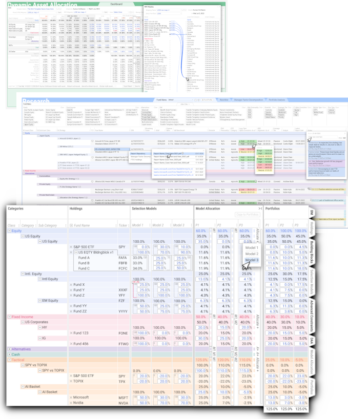
Franklin Templeton 2021-2024: Mosaiq
Scope: Complete visual and interaction design for these industry-leading portfolio manager and analyst tools.
Process: We designed the entire front end, including visual context & behavior. Then we did deep dives directly with portfolio managers and quantitative analysts, tying their workflows seamlessly together with tools that embody the understanding and behavior of each role.
Key Advantage: This project is true Cognitive Engineering: an exact fit of expert workflow. But it’s played out in a plain-old UX visual context to provide an easy on-ramp for experts used to common Web UX, and to make it easily implementable with the existing tech stack. The critical difference: where plain UX often squeezes out domain details—”vanillifies” each domain—to conform to overly-abstract paper-form-like 60s/70s widgets, we embraced those details to telegraph domain familiarity. These screens feel like the business, not the usual flat/annoying bunch of widgets experts need to learn—to practice a domain they already know…
Commercials: Thousands of screen mock-ups were delivered over three years; we led the collaborative honing of each with expert business-side co-designers. To exactly fit the questions and activated concepts in experts’s minds we injected scores of our own innovative “UX++” affordances. Each was instantly recognizable and usable, generally with no training at all. The same mock-ups also provided cut-and-paste CSS to speed implementation and improve code-to-design fidelity. Screens were delivered as 100% client-owned IP, but created from pre-existing didi elements that are available to fit future workflows just as tightly.

